Integrating 3D models with photography
Interested in integrating your 3D work with the real world? This might help
#
16
16-03-2006
, 01:44 PM
Registered User
Join Date: Nov 2005
Join Date: Nov 2005
Posts: 14
But I do recommend trying it out. It's very fun, almost clay like if u ever did sculpting.
#
17
17-03-2006
, 02:26 AM
take it easy and life will be easy
#
18
19-03-2006
, 09:24 PM
Registered User
Join Date: Nov 2005
Join Date: Nov 2005
Posts: 14
Zbrush second try
You should try going to their sitesite and also the forum there, to check out how it works and the talented art piece produced.
Anyway, here's my second attempt at Zbrushing. After adding the body, it was disappointing to find out that my comp could not support anything more then 800k of polygon. I was hoping to reach 2 million poly details, but looks like I need to upgrade my RAM first.
This are from Zbrush, I am going to try to re-render in another comp, for my mental ray is not working. Only done the head and abit of the chest and back.
Here's the pics. C&C please, thank you.
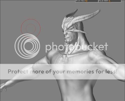
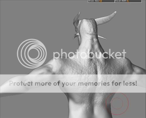
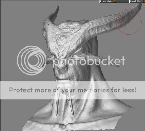
Last edited by Sicnarf; 19-03-2006 at 09:28 PM.
#
19
19-03-2006
, 11:03 PM
Anyway, the wacom would seem a berfect thing for something like this, though I'm thinking my skills aren't p to it really, I can't make a face yet.
I did get the latest 3D world and it has some video tuts of Z-brush on the disc. I'll check the version I have and see if it is a PLE or a demo. Thanks for the warning too, things are bad enough, so much to do so little time to it.
take it easy and life will be easy
#
20
05-04-2006
, 12:25 PM
Registered User
Join Date: Nov 2005
Join Date: Nov 2005
Posts: 14
Minor Update
Normal mapped
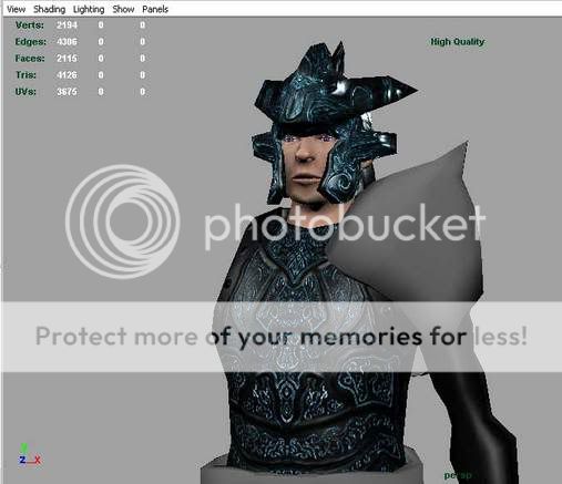
and the actual wireframe
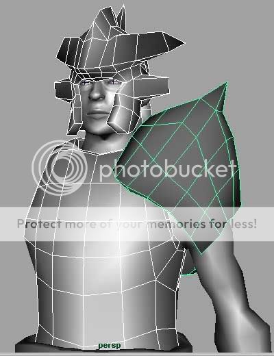
Please do critique.
More updates to come soon, once I finish this.
#
21
06-04-2006
, 12:14 AM
take it easy and life will be easy
#
22
06-04-2006
, 12:32 AM
Registered User
Join Date: Nov 2005
Join Date: Nov 2005
Posts: 14
#
23
06-04-2006
, 04:06 AM
A far as your model, very slight changes will pull all the parts into correct relative positions as a whole (is this making sense?) the shoulders, he angle of the armour compared to the body, in relation to the face, all these things will be easier to put into correct and relative position when you understand negative space. It is a way of measuring on thing against another to get correct proportion.
The jpeg is not so much about P and N space but is something that would be quickly noticed when you understand the relationship between what is there and what is not there. We see what we want to see even if it is not there, that is why it is important to understand what is not there?? good luck with that rave, its the best I can come up with at the moment but keep asking or try to find an art book called 'thinking with the left side of the brain' something like that, it's famous anyway. Pand N space is relative o what area of the model you are working in or on.
take it easy and life will be easy
#
24
06-04-2006
, 11:17 AM
Registered User
Join Date: Nov 2005
Join Date: Nov 2005
Posts: 14
 (which is a good thing, they know their art, well. Award winning fellows ya know.)
I still don't quite get it but somehow I understand what you mean. Let me clarify what I understand and you tell me if I am correct, k? In a way you mean the composition and design of the whole thing, face and armors and the intricate details, doesn't lead to one and another, nothing to hold the piece together. No sense of one-ness, so to say?
But yeah, I came to notice one more thing far worse the P and N currently. The Pauldron is not shoulder friendly, the knight can't raise his hand any higher then his chest. Gotta redesign it. Maybe I should post a really quick and rough sketch for the model's design?
Once again, thanks mirek03. I'll go check this book out, and yeah I heard of this book, something about drawing with the logic side of the brain. Keep the comments coming.
#
25
06-04-2006
, 09:02 PM
Registered User
Join Date: Jul 2004
Join Date: Jul 2004
Location: Northern California
Posts: 445
Basically I think what Mirek is trying to say about neg vs pos space can be summed up in one word: Silhoutte. Actually it is a very good practice to render (or adust your render in PS) a character where they are displayed as a solid silhoutte. Its an awesome way to judge proportions and center of gravity and to see if you're on the right track of making a character as instantly recognizable as possible to an audience.
I would say that the more complex shape of the helmet and head is making the rest of the model look way too simple. What stands out to me as needing the most attention is the shoulder piece.
Nice job so far, dude!
Dave
#
26
06-04-2006
, 09:05 PM
Registered User
Join Date: Nov 2005
Join Date: Nov 2005
Posts: 14
#
27
06-04-2006
, 09:25 PM
Personally I couldn't stand working like that, say you have spent 5 hours texturing the chest piece, load it up into maya and say "yep that looks perfect" you then go ahead and crack on with what you were doing before and see that you have accidently missed an important piece from your chest mesh, you then go ahead and model it in, thus changing the topology of the helm and screwing your texture meaning you have wasted 5 hours doing nothing.
Personally and I know a lot of others would agree, model every piece to completion, for example you have gone away and textured the chest and helm and left the shoulder part unfinished.
How can you see what the underlying model looks like if you are just staring at a pattern while trying to model a part that is supposed to match? In my opinion its an un-needed distraction, aslo because you have some parts textured while you are modeling others it drives you to rush the other piece because you want to get a matching texture applied.
(Not meant as a personal attack just some advice for the future
 )
)
#
28
06-04-2006
, 11:45 PM
You got some very good advise from those lads.
I particularly liked the message of distraction and yes, as I was trying to say, siluet.
go mate go...

I have to rush to a final cut seminar, I don't think i answered your question?? Just woke up, anymore queries write them up...
take it easy and life will be easy
#
29
07-04-2006
, 03:41 AM
Registered User
Join Date: Nov 2005
Join Date: Nov 2005
Posts: 14
Lol I guess if this is a commisionned professional work, I would have been a) screwed over and over by big boss or b) fired and sued for causing massive delay. Still I gotta finish it, thats what I tell myself. But I do appreciate the advice, and I'll keep those in mind for the next project.
Keep them coming, advices and C&C. Thanks once again fellows.
Posting Rules Forum Rules
Topics
New tutorial - Create tileable textures from photos. Photoshop to Alchemist to Maya 2
By David
Site News & Announcements
3
Free Courses
Full Courses
VFX News
How computer animation was used 30 years ago to make a Roger Rabbit short
On 2022-07-18 14:30:13
Sneak peek at Houdini 19.5
On 2022-07-18 14:17:59
VFX Breakdown The Man Who Fell To Earth
On 2022-07-15 13:14:36
Resident Evil - Teaser Trailer
On 2022-05-13 13:52:25
New cloud modeling nodes for Bifrost
On 2022-05-02 20:24:13
MPC Showreel 2022
On 2022-04-13 16:02:13


