Beer glass scene creation
This course contains a little bit of everything with modeling, UVing, texturing and dynamics in Maya, as well as compositing multilayered EXR's in Photoshop.
# 1 17-04-2011 , 08:02 PM
Dushyant's Avatar
Registered User
Join Date: Apr 2011
Location: On Earth
Posts: 168

Interior and Exterior

I did Modeling Texturing Lighting and Rendering

Feel free to critique everything.user added image

Attached Thumbnails

Last edited by Dushyant; 19-04-2011 at 06:46 PM.
# 2 17-04-2011 , 09:59 PM
daverave's Avatar
The thin red line
Join Date: Aug 2009
Location: England
Posts: 4,472
To be honest it looks a little cartoonish, I think its the wood texture and metal texture.also the lighting is not right its got no depth and so of you models are not casting any shadows .The cartoon look is that what you wanted? nice try but needs a little work.........dave


Avatar Challenge Winner 2010

Last edited by daverave; 17-04-2011 at 10:12 PM.
# 3 17-04-2011 , 10:42 PM
honestdom's Avatar
The Nurb Herd
Join Date: Oct 2007
Location: London
Posts: 2,381
Come on man, i think its obviously supposed to be cartoonish.
For me the textures let it down. Particularly the wood texture and the direction of the grain. The beam in the roof at the far wall especially. I was also wondering what the helmet and the anchor are made out of? it looks like egg shell with ink splats all over it.

The style of the scene is fun and i think the lighting and over saturation of the textures compliment this. Although i would imagine the light source in the celling is perhaps unnecessary, and may be a reason why dave thinks there are a lack of shadows.

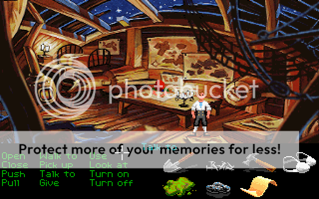
The modeling reminds me of monkey island or something similarly family friendlyish, however i think the radio is a little under designed and could do with some more work. The map picture frame could also do with some joints. Its unlikely to be one piece of wood.

also is it just me or is the antenna glowing slightly?

nice tho... a character behind the desk would really finish it off.


Last edited by honestdom; 17-04-2011 at 10:44 PM.
# 4 17-04-2011 , 11:23 PM
daverave's Avatar
The thin red line
Join Date: Aug 2009
Location: England
Posts: 4,472
no honestdom it not obviously to me that is why I asked at the end was a cartoon look he was after................dave


Avatar Challenge Winner 2010
# 5 18-04-2011 , 02:09 AM
bullet1968's Avatar
Lifetime Member
Join Date: Feb 2010
Location: Australia
Posts: 4,255
I agree the textures are off and need to be adjusted. In general the grain of timber will go length ways...not crossways as this would be weak timber. I like the eggshell look on the helmet and anchor etc but even in a cartoon it would be brass?? Yeh dom the map frame could do with some joints and the grain on both sides made longitudal with the timber. I also agree the centre light may not be needed...as you are in daylight and its a nice bright cheery room I would think the light be off..overall a goody mate...Monkey Island?? dont remember that one dom...

cheers bullet


bullet1968

"A Darkness at Sethanon", a book I aspire to model some of the charcters and scenes
# 6 18-04-2011 , 05:28 AM
murambi's Avatar
Head of 3d Admedia
Join Date: May 2007
Location: nairobi , ken-ya
Posts: 1,340
I think you need to add a bump map in there as well as adding abit of reflectivity

# 7 18-04-2011 , 07:02 AM
Dushyant's Avatar
Registered User
Join Date: Apr 2011
Location: On Earth
Posts: 168
First of all Thanks to everyone..daverave..honestdom..bullet..murambi..an d i have post this image on many sites but didn't get as good feebacks that i get here.
Thanks once again.

Yes I want to make this scene feel n look like cartoonist.
I think i have to decrease the overall illumination and the texture of helmet n metal props..and a bit specularity n reflectivity on antenna.I will definately make some changes with this image n will post it again.user added image
@HONESTDOM- can you please tell me about monkey island..user added image..

# 8 18-04-2011 , 07:08 AM
Dushyant's Avatar
Registered User
Join Date: Apr 2011
Location: On Earth
Posts: 168
@Bullet- ''the map frame could do with some joints'' didn't get it..:|

# 9 18-04-2011 , 09:18 AM
honestdom's Avatar
The Nurb Herd
Join Date: Oct 2007
Location: London
Posts: 2,381
woah, can't believe you guys don't know monkey island...
user added image
user added image

# 10 18-04-2011 , 11:26 AM
Joey81's Avatar
Subscriber
Join Date: Jan 2010
Location: Budapest, Hungary
Posts: 244
Good one. Really like the idea. Monkey Island & Day of the tentacle re the best ones user added image

# 11 18-04-2011 , 11:54 AM
Dushyant's Avatar
Registered User
Join Date: Apr 2011
Location: On Earth
Posts: 168

Exterior-Still lot work to do with this one.

I did modeling Texturing lighting and rendering.

Feel free to critique..user added imageuser added image

Attached Thumbnails
# 12 18-04-2011 , 05:33 PM
murambi's Avatar
Head of 3d Admedia
Join Date: May 2007
Location: nairobi , ken-ya
Posts: 1,340
absolutely love this image

# 13 18-04-2011 , 06:57 PM
Gen's Avatar
Super Moderator
Join Date: Dec 2006
Location: South FL
Posts: 3,522
I really like the lighting and coloring of the interior. A few things bug me though.

- The ceiling and walls seem to be very separate.
- How will the person get behind the desk and back out again?
- No chair.
- As mentioned before, the wood texture, especially on the ceiling looks strange. The grain direction is off.
- The wear/tear on the metal shader for the anchor and helmet would look better if it paid attention to the creases and crevices of the geometry.

The exterior shot. I see you didn't hold back on the grunge lol. The texturing is pretty solid. One area that doesn't seem to have any grunge build up is where that light blue concrete planter meets the ground. The leaves on the plant could use some translucency and as far as the lighting goes, it feels really cold, but that could be what you're after.


- Genny
__________________
::|| My CG Blog ||::
::|| My Maya FAQ ||::
# 14 21-04-2011 , 12:25 PM
Dushyant's Avatar
Registered User
Join Date: Apr 2011
Location: On Earth
Posts: 168

I really like the lighting and coloring of the interior. A few things bug me though.

- The ceiling and walls seem to be very separate.
- How will the person get behind the desk and back out again?
- No chair.
- As mentioned before, the wood texture, especially on the ceiling looks strange. The grain direction is off.
- The wear/tear on the metal shader for the anchor and helmet would look better if it paid attention to the creases and crevices of the geometry.

The exterior shot. I see you didn't hold back on the grunge lol. The texturing is pretty solid. One area that doesn't seem to have any grunge build up is where that light blue concrete planter meets the ground. The leaves on the plant could use some translucency and as far as the lighting goes, it feels really cold, but that could be what you're after.


Thank you for your great and informative feedback.

Posting Rules Forum Rules
You may not post new threads | You may not post replies | You may not post attachments | You may not edit your posts | BB code is On | Smilies are On | [IMG] code is On | HTML code is Off