Complex UV Layout in Maya
Over the last couple of years UV layout in Maya has changed for the better. In this course we're going to be taking a look at some of those changes as we UV map an entire character
# 211 09-05-2014 , 05:42 PM
Skalman's Avatar
Registered User
Join Date: Apr 2012
Posts: 293
user added image
user added image


20 year old guy from Sweden


Big Bob Marley fan
Love skateboarding
Maya, Mudbox and Photoshop user

Full name: Marcus Ralman


https://www.facebook.com/MarcusRalman3D

^ My facebook page ^
# 212 09-05-2014 , 08:31 PM
Jay's Avatar
Lead Modeler - Framestore
Join Date: Feb 2003
Location: UK
Posts: 6,287
Dude the topo is certainly getting there, you need to lose the loops in both areas where I suggested before...theres too much.

Also my trusty red pen has come out today to draw for you a skull so you can see the shape that the head needs to be. The skull is not round its almost a flat shape at the top that rise toward the back slightly.

I know translating from photos is difficult but I think a little more understanding of the anatomical side of things will greatly improve the head...

keep at it though!!

Jay

Attached Thumbnails
# 213 13-05-2014 , 07:00 PM
Skalman's Avatar
Registered User
Join Date: Apr 2012
Posts: 293
Thanks alot jay for the drawing man!! really appreciate it user added image thought i'd be finished with this model but nope (thats a good thing)! thanks again man


20 year old guy from Sweden


Big Bob Marley fan
Love skateboarding
Maya, Mudbox and Photoshop user

Full name: Marcus Ralman


https://www.facebook.com/MarcusRalman3D

^ My facebook page ^
# 214 13-05-2014 , 08:15 PM
NextDesign's Avatar
Technical Director
Join Date: Feb 2004
Posts: 2,988
These are the things that I see.

1) There should be an extra loop around the mouth to the nose.

2) There is too many polys on the forehead above the nose. Try to terminate some of them. You have too many polys in general for the shape that you have now. Lowering the number of polys will make it much easier to tweak.

3) The pole on the temples won't smooth nicely. Try spacing out and redirecting some of the edges in that area.

In general, you want your faces to be as square as possible. Some times this is not possible, but it's good to try.

user added image

user added image


Imagination is more important than knowledge.
# 215 14-05-2014 , 09:33 PM
Skalman's Avatar
Registered User
Join Date: Apr 2012
Posts: 293
user added image
user added image

did some changes, was hard to get rid of those nose-loops cuz they all are connected to important "detail-spots", also skull might still be bit too round at the very top? not sure.

this model feels so much cleaner now, and more details! wouldnt be able to point theese things out without your help, reply if you think i missed something or if i need further change

thanks again for the replies NextDesign and Jay!

edit: noticed at the throat of this model, in the end the polygons run into eachother kind of, might wanna change that also. would this be appropriate in this case do you think : user added image ?


20 year old guy from Sweden


Big Bob Marley fan
Love skateboarding
Maya, Mudbox and Photoshop user

Full name: Marcus Ralman


https://www.facebook.com/MarcusRalman3D

^ My facebook page ^

Last edited by Skalman; 15-05-2014 at 10:07 PM.
# 216 26-05-2014 , 08:53 PM
Skalman's Avatar
Registered User
Join Date: Apr 2012
Posts: 293
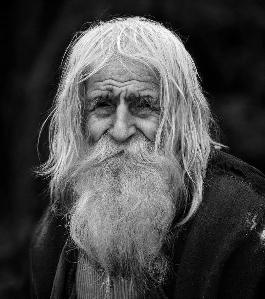
new model, some challenges because wrinkles, this man is 99 years old!
user added image
user added image

This project will have me focusing on hair and sculpting in mudbox, which i need practise on .... user added image


20 year old guy from Sweden


Big Bob Marley fan
Love skateboarding
Maya, Mudbox and Photoshop user

Full name: Marcus Ralman


https://www.facebook.com/MarcusRalman3D

^ My facebook page ^
# 217 27-05-2014 , 04:33 AM
NextDesign's Avatar
Technical Director
Join Date: Feb 2004
Posts: 2,988
Your proportions are quite off, and your topology has taken a step backwards in my opinion. Take a look at the muscles in the face, this is what topology is based on.

user added image
(C) Peter Ratner

Under that beard is the same muscle flow as everyone else. You shouldn't have to change your underlying topology in order to match it to new characters. You simply augment them instead, cutting in more details when needed.

Also make sure you have reference material while you're working. However you must get the hang of looking at shapes and form in the perspective window rather than simply matching in the orthographic views. Take a step back and be critical on your model. Is his chin really that sharp? Probably not. Does it stick out that far? Probably not. Are his eyes that small? Again, probably not.

Also, I would highly recommend that you finish one project before starting the next. It always sucks when it comes to an interview and you don't have a single thing finished; only partially finished things.


Imagination is more important than knowledge.
# 218 27-05-2014 , 07:27 AM
Jay's Avatar
Lead Modeler - Framestore
Join Date: Feb 2003
Location: UK
Posts: 6,287
Skalman

I think we already discussed those loops in the PM anyway and I have made my comments about too much geo in areas as well.

As for the pole on the side of the forehead, people have many opinions about pole placement, the side of the forehead is new on me LOL....its not an area that deforms like the rest of the face...in fact its just skin slide in that area not really a muscle there to deform into something relevant....so its up to you on that one. Personally I'd leave it.

Faces are hard to do and to do right if thats the correct term to use. The more you do the better you will become and the more you will learn....especially from scratch...its always hard to do from scratch, you are heading in the right direction. Its only a matter of time before you get a grip on it from your own perspective and nail the good and bad in a mesh...and work out your own work flow....with or without a scan


Jay

# 219 27-05-2014 , 12:22 PM
Skalman's Avatar
Registered User
Join Date: Apr 2012
Posts: 293
user added image
user added image
user added image

thanks for the replies guys!
truth is i didnt have any side reference so i drew a side reference by looking at the character + the proportions, but im still not very good with getting them right, and my references messed up/didnt match with new references so i decided to try without a side reference, so much of this model is from my perspective and view on this character, which probably is why its so wrong in areas.

anyways with those new pics i've been using new references so the head will follow the head-proportions a litle more this time hopefully...


20 year old guy from Sweden


Big Bob Marley fan
Love skateboarding
Maya, Mudbox and Photoshop user

Full name: Marcus Ralman


https://www.facebook.com/MarcusRalman3D

^ My facebook page ^

Last edited by Skalman; 27-05-2014 at 02:01 PM.
# 220 31-01-2015 , 01:56 PM
Registered User
Join Date: Sep 2011
Posts: 109
It's my first try to create human with poly flow in mind.
I know some things can be done better for sure.
I'm also wondering is thee any general rules for muscle topology ? Every individual is different, so flow is bot different as well, I guess. What are main mistakes in my topology ?

Attached Thumbnails
# 221 01-06-2015 , 04:12 PM
Registered User
Join Date: Jan 2013
Posts: 12

Crit Time

Would love to have your thoughts on this head model
Think I have got the edge flow partly right but to me there's something about the head that doesn't look right.

Attached Thumbnails
# 222 05-06-2015 , 07:18 PM
Registered User
Join Date: Sep 2011
Posts: 109

Would love to have your thoughts on this head model
Think I have got the edge flow partly right but to me there's something about the head that doesn't look right.

I'm not expert myself, but you could add more flow lines around mouth area - if you plan to animate it somehow. If not, it doesn't really mater. For shape, just get some inspiration of face you think is attractive, think each part separately, adjust it point by point then get back to general shape.

# 223 16-10-2015 , 07:57 AM
ivkov
Guest
Posts: n/a

Poles with 5 edges

There is a rule in hard surface modeling, about not to place vertices with valence of 5 on curved surfaces either convex or concave, in other words not to have poles with more than 5 edges on curved surfaces. But then we always see them on organic models which are all curved and smooth like the faces and body of our characters. The question is, if we have poles with 5 edges, how curved is a curved surface in this rule?

# 224 24-10-2015 , 08:18 AM
Jay's Avatar
Lead Modeler - Framestore
Join Date: Feb 2003
Location: UK
Posts: 6,287
a great point to raise Ivkov

Ive seen some stuff at work that would make your toes curl LOL

Models now are becoming more and more dense, especially as engines like arnold are handling extremely hi poly counts at render time. The 5 edge is going by the way side a little. When we were using smooth poly and Subds on characters, the mesh was lower in terms of resolution so when smoothed, the algorythm was trying smooth between the polys of a greater width so therefore the issues of pinching were increased because of the curves pulling in those 5 different directions of edge flow, but now with the higher poly count there is less chance of this issue arising because the polys are more and the distance less. That said, if you can avoid a point to 5 edges situation then all the better for the model anyway. And on characters, avoid at all cost in any area that deforms, eye lids cheeks, nasal labial folds, mouth corners and so on...

its just practice to achieve it, once you have it nailed then you are golden!


Jay

# 225 08-01-2017 , 01:17 PM
Jay's Avatar
Lead Modeler - Framestore
Join Date: Feb 2003
Location: UK
Posts: 6,287
so some new topology images!!

Work has been very busy for a while and also with new tutorials being done now, Ive finally had some time to be able to sit and do some new bits. This is a retopo mesh over a scan mesh. You will notice that there arent any major edgeloops in terms of muscle groups.This mesh currently has 6203 polys so still very low.
I few months back I finished digi double work on Marvels Dr Strange and learned a hell of a lot in terms of how the meshes are created and dealt with right now. We were basically using an in house mesh with a base poly count of around 18-20,000 polys, this in turn is used as the sculpt mesh which would obviously get divided right up, sculpted, and then the mesh in maya would be updated from this, still using the base. We would use either a blendshape to transfer the difference or transfer attributes on the base mesh, just depends on the uv situation as well. The base mesh would get aligned to a scan of the actors using Wrap X, which is an amazing tool. have a look at the demo stuff here, Im sure some of you would have seen it. https://www.russian3dscanner.com/ in turn the mesh would still require some light adjustment in Zbrush. We would have a muscle group texture map to show where to align and keep the mesh looking 'correct' but still keeping the character looking like the actor.

anyway I'll be working it up to a decent res, with some projection work over the top so I will keep it the updates coming as soon as I have something I feel I can show you

cheers
Jay

Attached Thumbnails
Posting Rules Forum Rules
You may not post new threads | You may not post replies | You may not post attachments | You may not edit your posts | BB code is On | Smilies are On | [IMG] code is On | HTML code is Off