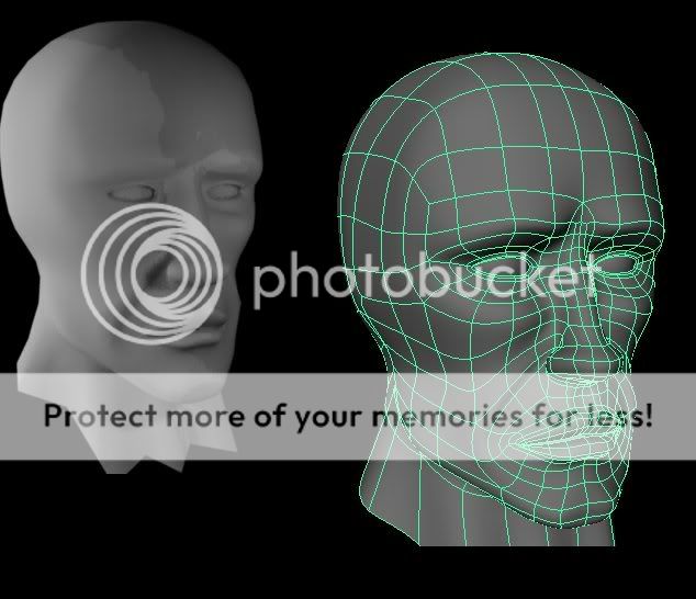
 the only thing that stands out to me are the polys on his nose - i might not have them come to a point like that - though on the smooth head it doesn't look too bad.
Introduction to Maya - Rendering in Arnold
This course will look at the fundamentals of rendering in Arnold. We'll go through the different light types available, cameras, shaders, Arnold's render settings and finally how to split an image into render passes (AOV's), before we then reassemble it i
#
91
24-04-2007
, 02:43 PM
 the only thing that stands out to me are the polys on his nose - i might not have them come to a point like that - though on the smooth head it doesn't look too bad.
#
92
24-04-2007
, 05:43 PM
Personally Id lose the tris on the cheek crease area, Its a would-be deforming area, if you are going to do animation. Also for arguements sake I'd also lose the tris on the nose. But thats just me - no tris!
Cheers
Jay
#
93
24-04-2007
, 09:37 PM

I've gotten rid of as many tris i could find. Unfortunatley some 5 sided faces have appeared but they aren't in any major areas.
#
94
19-06-2007
, 08:49 PM
#
95
13-08-2007
, 12:18 PM
#
96
01-10-2007
, 12:19 AM
Not bad but lots of room for improvement. I would get rid of alot of geometry on the face as it very cramped in there. Also have a look at some of the earlier posts in this thread on edge looping the mesh. The post previous to this is a good example by Some Guy, its a nice mesh to work on.
Its all just practice at the end of the day, keep at it
Jay
#
97
01-10-2007
, 08:21 AM
#
98
25-10-2007
, 07:24 AM
I am nobody. Nobody is perfect. Therefore I am perfect.
#
99
25-10-2007
, 07:36 AM
Cheers
"No pressure, no diamonds" Thomas Carlyle
#
100
13-11-2007
, 05:30 PM
https://www.highend3d.com/maya/tutori...gon/277-1.html
https://www.highend3d.com/maya/tutori...gon/243-2.html
I haven't tried the eye yet but it looks helpful.
I also have a question - What is the best poly formation around joints (for skinning purposes)? Obviously there's a difference between joints, so can you also post examples for different joints eg shoulder, elbow, wrist, neck etc.
#
101
13-11-2007
, 05:54 PM
thanks for the links
Cheers
Jay
#
102
24-11-2007
, 04:01 PM
Registered User
Join Date: Jan 2007
Join Date: Jan 2007
Location: Edmonton, Alberta
Posts: 153
Also, is it better to have tri's that follow muscle lines or not have muscle lines and be strict on mesh unity?

Last edited by wokendreams; 24-11-2007 at 04:27 PM.
#
103
11-12-2007
, 07:41 AM
Edit: And yeeey on my fourhundreth post here.


#
104
11-12-2007
, 09:46 AM
I would try to keep it all quads, no tris, that way you can use the edges to define the loops of the face.
Weyu,
I would watch the placements of the poles, try to have them in areas that dont move when animated, the ones that stand out is on the nose, if the mesh is animated then the placements of them could cause funny problems with the mesh.
"No pressure, no diamonds" Thomas Carlyle
#
105
24-12-2007
, 01:37 AM
Is there something else that looks off? Sometimes I have hard looking at my own work and find flaws.
Its hard to fit in time between work and friends, gotta be done before april tho.

Posting Rules Forum Rules
Topics
New tutorial - Create tileable textures from photos. Photoshop to Alchemist to Maya 2
By David
Site News & Announcements
5
Free Courses
Full Courses
VFX News
How computer animation was used 30 years ago to make a Roger Rabbit short
On 2022-07-18 14:30:13
Sneak peek at Houdini 19.5
On 2022-07-18 14:17:59
VFX Breakdown The Man Who Fell To Earth
On 2022-07-15 13:14:36
Resident Evil - Teaser Trailer
On 2022-05-13 13:52:25
New cloud modeling nodes for Bifrost
On 2022-05-02 20:24:13
MPC Showreel 2022
On 2022-04-13 16:02:13


