Introduction to Maya - Modeling Fundamentals Vol 2
This course will look in the fundamentals of modeling in Maya with an emphasis on creating good topology. It's aimed at people that have some modeling experience in Maya but are having trouble with
complex objects.
#
106
24-12-2007
, 11:42 AM
I dont think the placement of the poles are that bad to be honest.
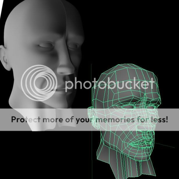
the one on the cheek is okay, its not placed in an area that will cause probs if you were to make it animatable (ie:blendshapes) the one I would look at and redirect the edge flow is th one near the mouth, Ive penned over your render, so you can see.
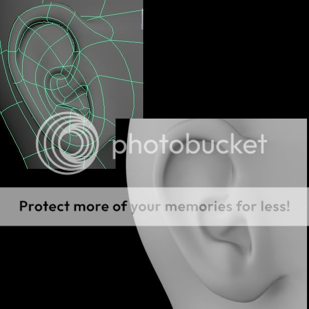
the forhead to from the nose could use a little tweak. Just bring the edges a little higher and terminate them as before. but I wouldnt worry too much with these areas until the whole head is complete at base level with an ear included, then go to town adding and refining the mesh. you'll see more areas to tweak as you go and want to improve later.
Try and keep the polys as near to square as possible too if you can, this will help immmensley in the uv editor.
Overall its a pretty good start
Cheers
Jay
#
107
16-02-2008
, 07:10 PM

"Climbing the walls of the 'Uncanny Valley"
#
108
23-02-2008
, 03:03 PM

I've tried following your advice and I think I've managed to change the location of the pole on the chin.


#
109
31-03-2008
, 01:19 AM
#
110
31-03-2008
, 01:53 AM
Cheers
Jay
#
111
31-03-2008
, 11:28 PM

#
112
31-03-2008
, 11:31 PM
#
113
01-04-2008
, 12:41 AM
_J
#
114
11-04-2008
, 01:04 AM
And the fact that it doensnt have a mouth is really creeping me out!

And yeah the hole of the nostrils are way to thin as stated before by Jay.
Looking at my work a few weeks after is kind of fun, I feel more pleased with it now then when I was working with it, finnaly I feel that I got a idea of how a human looks like, my first attempts were just patethic.

#
115
15-04-2008
, 05:19 AM
#
116
15-04-2008
, 05:21 AM
#
117
15-04-2008
, 05:28 AM

And yes the mouth is a real horror for all of us that dont have the topology of the face covered yet. I think that it look a bit to flat right now tho, it need to follow the shape of the head. I personaly think its easier when I think that some teeth are supposed to be behind that shape.
I hope it helped a bit, for more detail about the topology check this thread or google.

Best of luck!
#
118
15-04-2008
, 05:32 AM
 i can't get 2 fingers in my nose ... :blush: this is my size nose (rofl) i will check some topology ... some things .. i work on this mouth about 2 days now .. and still getting this fu*** shape ... :headbang:
#
119
15-04-2008
, 06:27 AM
To me your nose looks like this.


While a real nose looks like this(And no its not me its just some random pic from google.
 )
)
And as you can see I'm ofcourse talking about the nostrils.
#
120
11-05-2008
, 07:42 PM
 i will get it into Zbrush and shape it till it gets good forms
add critics about everything ... i know the nose wholes are not right ... some more stuffs are not right ..... yeah i'm still newbie in Topology
 but i will learn k w8 C&C i will start my first steps into Zbrush so will be hard i think
  :blush:
Posting Rules Forum Rules
Topics
New tutorial - Create tileable textures from photos. Photoshop to Alchemist to Maya 2
By David
Site News & Announcements
3
Free Courses
Full Courses
VFX News
How computer animation was used 30 years ago to make a Roger Rabbit short
On 2022-07-18 14:30:13
Sneak peek at Houdini 19.5
On 2022-07-18 14:17:59
VFX Breakdown The Man Who Fell To Earth
On 2022-07-15 13:14:36
Resident Evil - Teaser Trailer
On 2022-05-13 13:52:25
New cloud modeling nodes for Bifrost
On 2022-05-02 20:24:13
MPC Showreel 2022
On 2022-04-13 16:02:13


