Complex UV Layout in Maya
Over the last couple of years UV layout in Maya has changed for the better. In this course we're going to be taking a look at some of those changes as we UV map an entire character
# 1 25-01-2006 , 01:41 AM
Registered User
Join Date: Nov 2005
Posts: 14

Dragonape

Hi, first post here. I am modelling a half-dragon for portfolio. The model is based Zack Petroc's super average, as I am learning how to model the body. Will be using this for animation and later Zbrushed for normal maps. Please give positive C&C,as I really want to make this the best. Btw, great site, a sad thing though that I can't afford to subscribe yet.

Anyway here it is.

user added image

# 2 25-01-2006 , 01:46 AM
Joopson's Avatar
Registered User
Join Date: Jul 2005
Location: Boston, MA
Posts: 2,314
i like it, i dont have any crits, except make the head a tiny bit bigger
cheersuser added image
andy


Environment Artist @ Plastic Piranha
www.joopson.com
# 3 25-01-2006 , 01:50 AM
Registered User
Join Date: Nov 2005
Posts: 14
Umm can't do, for I fear it will take away too much attention. And speaking of which, I am even planning to delete the whole body and redo everything, due to comments from my friends that say the body is bland compared to the head.

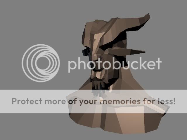
Anyway here's the head

user added image

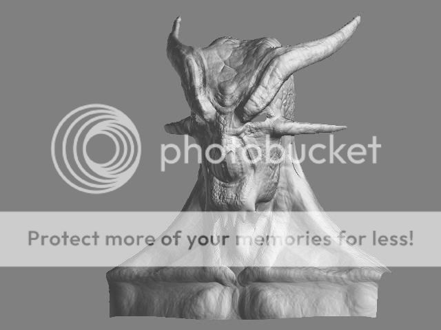
And my first attempt at Zbrushing it
user added image

Thanks Joopson

# 4 25-01-2006 , 02:11 AM
Joopson's Avatar
Registered User
Join Date: Jul 2005
Location: Boston, MA
Posts: 2,314
wow, thats amazing! zbrush rocks and so do you, lol!


Environment Artist @ Plastic Piranha
www.joopson.com
# 5 25-01-2006 , 02:58 AM
mc-fleury's Avatar
Registered User
Join Date: May 2005
Location: canada
Posts: 914
nice model so far!keep it up.

# 6 25-01-2006 , 03:21 PM
Shadeblade's Avatar
Registered User
Join Date: Mar 2005
Location: Grande Prairie, Alberta, Canada
Posts: 779
You have good hands with Zbrush. user added image I like the way this turned out for you. I can imagine that something like this would be a bit of a hassle to texture, but imagine the results! Great work!

(I noticed that the "flesh goatee" under his chin is very smooth compared to the rest of his skin. I'm not sure if that's what you wante, but I just thought it looked a little strange. Hardly noticeable, though!)

Keep it up! I hope to see more stuff like this. :bow:


Nobody felt like avenging your death. Sorry.

Last edited by Shadeblade; 25-01-2006 at 03:23 PM.

# 7 25-01-2006 , 05:05 PM
Subscriber
Join Date: Oct 2005
Location: US of A
Posts: 114
I might consider adding more detail to the nase model before going to zbrush. There are a few areas that could still be refined. So far so good though.


Death is certain, Life is not.
# 8 29-01-2006 , 08:07 AM
Subscriber
Join Date: Jun 2004
Location: San Jose, CA
Posts: 490
wow zbrush gave it an extremely intricate texture. Sweet. user added image

# 9 29-01-2006 , 02:16 PM
MattTheMan's Avatar
Registered User
Join Date: Apr 2005
Location: Fairfield, CT
Posts: 2,436
hmm... but I have to say that you can too obviously see where the circles of your brush were. Maybe a softer one? so the circles dont show up as much?

but excellent details in zbrush! 4 stars


Live the life you love, love the life you live
# 10 01-02-2006 , 11:15 AM
Registered User
Join Date: Nov 2005
Posts: 14
Sorry guys, no update lately, due to holidays and new assignment. Anyway, I appreciate the comments, and for your information, that is my first Zbrush. wanted more soft details but my PC can't handle the polygon.

Will update it ASAP

# 11 10-03-2006 , 07:37 AM
Registered User
Join Date: Nov 2005
Posts: 14

Long update

Finally got my lazy bump to finish touching up this one. Anyway, I am having problem, and not completely satisfied with the way the muscles turned out. Any advice out there?

Front
user added image

Back
user added image

# 12 10-03-2006 , 01:55 PM
Registered User
Join Date: Dec 2005
Posts: 187
the forarms are way to thick, not in the verticle but in the depth sense, and also the thighs id put the mucles a bit higher up cos there kinda low down his thigh rather tha were they should be.

# 13 10-03-2006 , 03:22 PM
Registered User
Join Date: Nov 2005
Posts: 14
Gotcha, fixing it asap. Forearm too thick, thigh too low

# 14 12-03-2006 , 07:39 PM
13th_resident's Avatar
Subscriber
Join Date: Feb 2006
Location: London
Posts: 703
wow looks like z brush is better than i thought...
thats a cool model!!!


A pint of example is worth a gallon of advice!!
# 15 16-03-2006 , 03:13 AM
mirek03's Avatar
Subscriber
Join Date: Feb 2006
Location: Australia
Posts: 2,752
is Z brush needed for this sort of style or can it be done without it? Great model and it has a lot of people talking 'Z brush', including me.


take it easy and life will be easy
Posting Rules Forum Rules
You may not post new threads | You may not post replies | You may not post attachments | You may not edit your posts | BB code is On | Smilies are On | [IMG] code is On | HTML code is Off