Introduction to Maya - Rendering in Arnold
This course will look at the fundamentals of rendering in Arnold. We'll go through the different light types available, cameras, shaders, Arnold's render settings and finally how to split an image into render passes (AOV's), before we then reassemble it i
# 1 25-04-2007 , 01:23 AM

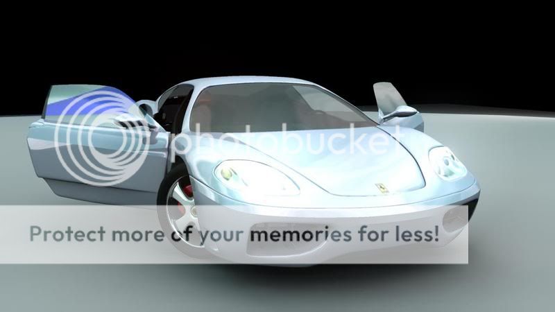
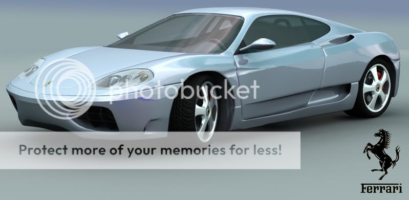
My Ferrari

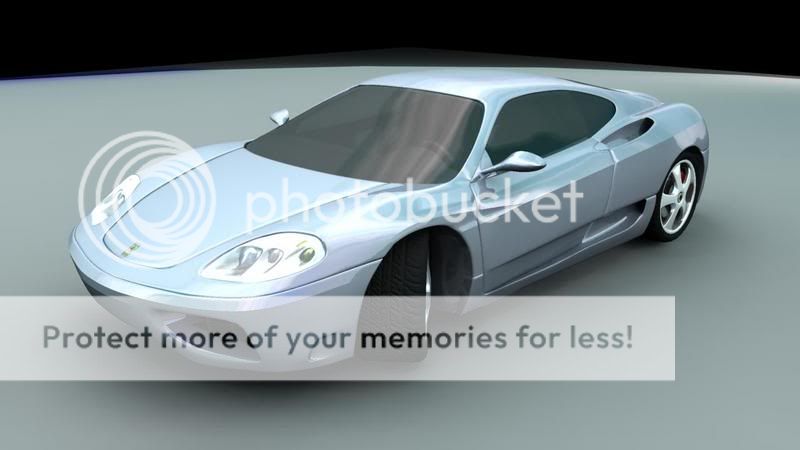
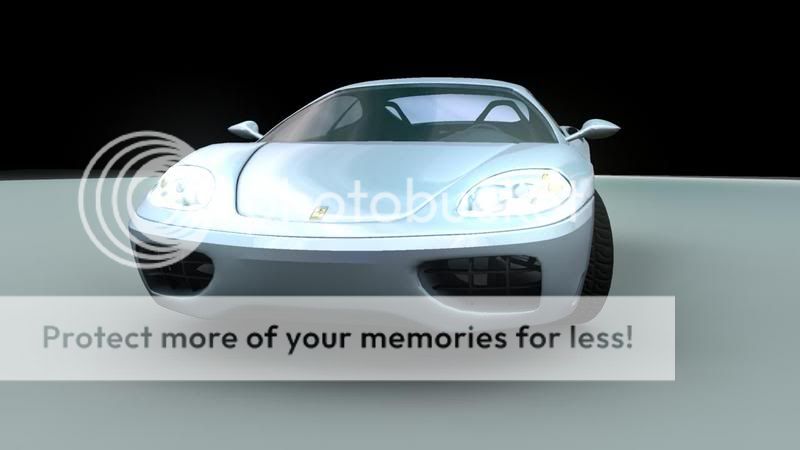
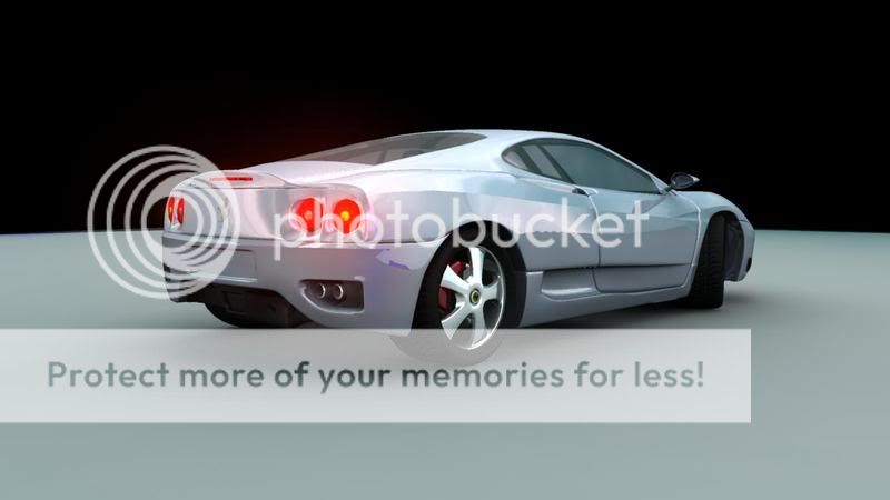
I have been learning maya and found the ferrari tut which is definatly the best car tut out there. just looking for some crit as im going to escape studios in summer and would like to be well developed before i go.

Thanks

user added image

user added image

user added image

user added image

Some of the renders have the head lights turned on hence the very shiny front.

# 2 25-04-2007 , 02:29 AM
Perfecto's Avatar
Registered User
Join Date: Mar 2007
Location: TN (USA)
Posts: 1,889
I don't know if it's the tutorial but this is the second model I've seen and I have the same comment. The edges of the doors and the hood seem too rounded and/or the gap is to wide. I havn't seen the tut or done it myself but I think it would look more realistic with tighter, less rounded edges. Here some reference links. Other than that, you really did a great job.

https://users.wfu.edu/rudni5/images/F...ena-03_800.jpg

https://www.rsportscars.com/foto/04/f...60f1_front.jpg

Hope all goes well for you at the studio.


Don't be satisfied with what you can do but rather strive to do the things you can't do!
Exceed Expectations!
# 3 25-04-2007 , 04:28 AM
publicFunction's Avatar
Senior Software Developer
Join Date: Jan 2005
Location: Livingston, Scotland
Posts: 1,701
Perfeco is right on that, its a well done model but the gaps between the doors and sill and the bonnet and main body are to "open", if you still have the history on the model locate the bevels and tighten them a bit.

Chris (formerly R@nSiD)
Twitter
When the power of love overcomes the love of power the world will truely know peace - Jimmy Hendrix
Winner SM VFX Challenge 1
3rd Place SM SteamPunk Challenge (May 2007)
# 4 29-04-2007 , 10:07 AM
wasatch5_sparticus's Avatar
Registered User
Join Date: Feb 2007
Location: my house!!
Posts: 261

Originally posted by R@nSiD
Perfeco is right on that, its a well done model but the gaps between the doors and sill and the bonnet and main body are to "open", if you still have the history on the model locate the bevels and tighten them a bit.

Yeah, however, it's a very nice color for it! Good work on that!

Sparticus


Expect to excell...
# 5 29-04-2007 , 11:15 AM


Last edited by richand26mhz; 29-04-2007 at 11:17 AM.
# 6 10-05-2007 , 11:06 AM
Subscriber
Join Date: Feb 2006
Posts: 1,937
yeah the gaps look alot better now ... could you render this in red if you dont mind see most ferrari's i see are red :p

also just curious, are you sure your aloud to use that ferrari symbol? lol ... since you might be crossing the copy-laws rights and all that stuff

# 7 10-05-2007 , 04:38 PM
publicFunction's Avatar
Senior Software Developer
Join Date: Jan 2005
Location: Livingston, Scotland
Posts: 1,701
MJ is right it looks a lot better. However user added image

The shadows under the car are too dark and the tyres are blacked out due to it. Try to improve the lighting by using HDRI and MR, also render with GI and it should help a lot.


Chris (formerly R@nSiD)
Twitter
When the power of love overcomes the love of power the world will truely know peace - Jimmy Hendrix
Winner SM VFX Challenge 1
3rd Place SM SteamPunk Challenge (May 2007)
# 8 10-05-2007 , 10:51 PM

Try to improve the lighting by using HDRI and MR, also render with GI and it should help a lot

This was rendered with all the ablove settings. i used some hdr from the Dosch chrome and studio affects dvd.

As for the copyright of the image i dont really think ferrari would be that bothered lol I wounder if simply Maya has to get a copyright from the companies? Ferrari, lucas art, weta digital etc..

# 9 11-05-2007 , 06:34 AM
Subscriber
Join Date: Feb 2006
Posts: 1,937
"i dont really think ferrari would be that bothered lol"

thats true just making sure because one of my friends designed 3d racing seats and threw on the bmw logo for his porfolio to look good which ended up to be in an art gallery ... one week later he was called by bmw and was told off for using it and that they would let him off that time. pretty lucky though i reckon user added image

# 10 11-05-2007 , 04:39 PM
well when i did car design at uni we used companies badges all the time in galleries, we did work for Ford and various other companies and never had any problems. must have been a one off with your friend lol. I will try and get a red one out for you, i did it in metalic blue as i thought red was a bit predictable.

# 11 12-05-2007 , 06:00 AM
Subscriber
Join Date: May 2005
Posts: 240
that looks great! and i love the color

# 12 12-05-2007 , 09:54 PM
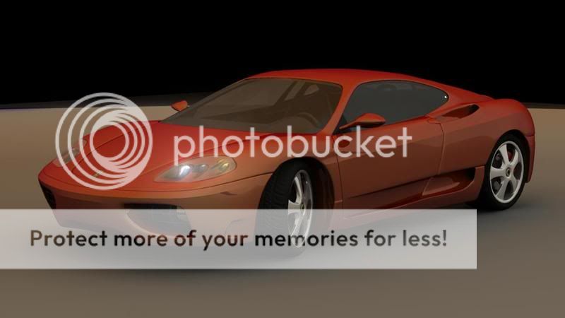
tried it in red, its a bit dark, might need to try a different probe.

user added image

# 13 15-05-2007 , 02:05 PM
BadG3r's Avatar
Subscriber
Join Date: Jan 2007
Location: Frankfurt
Posts: 216
hey!

which clas are you gonna take???

me, im gonna for the vfx professional in early 2008.

sry for off topic

# 14 17-05-2007 , 06:36 AM
im going to do maya for games comp, only a few more weeks until i go. i cant wait.

Posting Rules Forum Rules
You may not post new threads | You may not post replies | You may not post attachments | You may not edit your posts | BB code is On | Smilies are On | [IMG] code is On | HTML code is Off

Similar Threads