Integrating 3D models with photography
Interested in integrating your 3D work with the real world? This might help
# 1 03-03-2008 , 12:47 AM
Weyu's Avatar
Registered User
Join Date: Nov 2006
Location: Sweden
Posts: 482

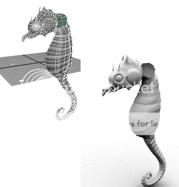
Seahorse

I'm moddeling a seahorse(obviously) and now I wonder if you got some helpful criticue and comments for me. user added image

user added image

# 2 03-03-2008 , 01:26 AM
Mayaniac's Avatar
As Zbrushiac sounds stupid!
Join Date: Nov 2007
Location: Derby
Posts: 1,241
This looks pretty good!

The only thing that I see thats not sitting quite right with me (based on Google Image search for seahorse) Is that the mouth seems off. Yours looks more like an elongated beak, whereas the seahorses look more like a horse mouth only extremely thin. user added image

Here are some Images I found:

https://images.google.com/images?q=Se...=1&sa=N&tab=wi

Just Copy and paste the URL. The Hyper Link won't work because of a certain arrangement of symbols... So SM thinks there Smilies...... O'Well.

Also the eyes seem too big.

Anyway, This looks pretty damn sweet!

Nice work!


www.stevenegan-cgi.com

"Your weapons are no match for ours! People of Mars, surrender!"
"Um, this isn't Mars. This is Earth."
"Earth? Earth-with-nuclear-weapons Earth?"
"Yes."
[long pause] "Friend!!"

Last edited by Mayaniac; 03-03-2008 at 01:29 AM.
# 3 03-03-2008 , 04:10 AM
Dutch's Avatar
Registered User
Join Date: May 2005
Posts: 49
Use the following format (replace the "{}" with "[]"): {url=link}whatever name{/url}

Example (again - replace the brackets):

{url=https://images.google.com/images?q=Sea+Horse&ie=UTF-8&oe=utf-8
&rls=org.mozilla:en-USfficial&client=firefox-a&um=1&sa=N&tab=wi}Seahorses{/url}

gets you:

Seahorses

# 4 03-03-2008 , 02:03 PM
Weyu's Avatar
Registered User
Join Date: Nov 2006
Location: Sweden
Posts: 482
Thanks, well yeah I'm aware that the trout/mouth/nose/whatever is kinda off, the mouth area needs alot of work and the nose area need to be pulled back a bit to match the reference. user added image

Will probably update this later this weekend.

# 5 21-03-2008 , 04:13 PM
Weyu's Avatar
Registered User
Join Date: Nov 2006
Location: Sweden
Posts: 482
Okey Its been a while but here I'm with a update. Right now my main concern is to make the seahorse blend more into the background. I'm also going to add a fish to the left trying to add a little more life to the scene. user added image

user added image

# 6 21-03-2008 , 04:25 PM
NeoStrider's Avatar
Registered User
Join Date: Jun 2004
Location: Cleveland, Ohio (USA)
Posts: 1,541
i see the original pic at the top, but not this new one... is it posted, or is it hosted in an image hosting site? i just really wanted to see the progress on this one <sigh>


ugh nevermind. the first pic doesn't show now either. i hate this web blocking stuff.


Accept no substitutions.

Last edited by NeoStrider; 21-03-2008 at 04:27 PM.
# 7 21-03-2008 , 04:33 PM
Weyu's Avatar
Registered User
Join Date: Nov 2006
Location: Sweden
Posts: 482
Well the images are hosted by Photobucket.com and are visible to me, if this is a common problem then I should start looking for another hosting solution. user added image

# 8 21-03-2008 , 05:34 PM
t1ck135's Avatar
Registered User
Join Date: May 2004
Location: UK
Posts: 1,991
looking nice weyu

the first one looked like a character for an animation and the new one looks like a realistic representation, keep it up user added image

Simon


Examples of bTraffic - a traffic animation tool for Maya
bFlocking - a tool for Maya 8.5+ to generate flocking and swarming behaviours
Jan/Feb Challenge 2007 Entry and W.I.P
May/Jun Challenge 2006 Entry and W.I.P
Mar/Apr Challenge 2006 Entry and W.I.P
Jan/Feb Challenge 2006 Entry and W.I.P
Nov/Dec Challenge 2005 Entry and W.I.P
Sep/Oct Challenge 2005 Entry and W.I.P
Jul/Aug Challenge 2005 Entry
www.flash-fx.net
# 9 21-03-2008 , 05:37 PM
NeoStrider's Avatar
Registered User
Join Date: Jun 2004
Location: Cleveland, Ohio (USA)
Posts: 1,541
nope, it's just me. work security measures.


Accept no substitutions.
# 10 22-03-2008 , 02:27 AM
Weyu's Avatar
Registered User
Join Date: Nov 2006
Location: Sweden
Posts: 482
Well I do try to take small steps. user added image

Hmm is it just me or does it look a bit dark on other computers that arent mine.

I just realized that I have to make more textures for the chain to, right now its just one for all.

And thanks for the replies.

# 11 22-03-2008 , 03:11 AM
Jay's Avatar
Lead Modeler - Framestore
Join Date: Feb 2003
Location: UK
Posts: 6,287
Weyu

Well done mate. these little dudes are just fascinating to watch

If I were to give it a bit of crit, I would add a spot light to the whole scene, perhaps as an edge light to pick out the seahorse a bit more. As it stands it fits well into the scene, but I think it just needs that bit of contrast to make it 'pop'

Maybe go in tighter to it as well as theres lots of space composition wise, and turn the Seahorse a bit, as looking at things from the side can be a little stale or boring.

Ive done a version using your seahorse very quickly (hope thats okay) just to give an idea of what you could do. Remember these things are tiny and live and literally hold onto the weeds for protection and reproducing

Nice going though so far, oh and dont forget what Paint fx has to offer...it has a plethora of sea shells etc so...

Jay

Attached Images
# 12 22-03-2008 , 06:33 AM
Weyu's Avatar
Registered User
Join Date: Nov 2006
Location: Sweden
Posts: 482
Sadly I dont think I got time to have a clearly visible ground, but adding some seagrass closed to the seahorse sounds like a good idea, a long stalk on the right could make the scene fill a little more alive. And maybe I should make the chains larger to give the impression that the seahorse is really small. I will see if I'm able to turn the seahorse, I had some problem with my sss shader when I tried to do that before.

And what is an edge light?

And ofcourse you're free to use my seahorse as long as you pay royalty. user added image

Thanks for the critique, I will try to improve the scene but its hard to find the time with work going on. user added image

# 13 22-03-2008 , 06:38 AM
Jay's Avatar
Lead Modeler - Framestore
Join Date: Feb 2003
Location: UK
Posts: 6,287
No Probs

An edge light or backlight is basically the term used to pick out an object , to illuminate its form, in this case the edges. The idea is to separate it from the background a little more and this can be achieved with this type of effect. It also help to give the effect of a more direct lightsource

cheers
Jay

# 14 22-03-2008 , 07:44 AM
LauriePriest's Avatar
Moderator
Join Date: May 2003
Location: London
Posts: 1,001
hehe I call it a rim light.

# 15 22-03-2008 , 08:03 AM
Jay's Avatar
Lead Modeler - Framestore
Join Date: Feb 2003
Location: UK
Posts: 6,287
well you light your rim and I'll light my edges LOL

_J

Posting Rules Forum Rules
You may not post new threads | You may not post replies | You may not post attachments | You may not edit your posts | BB code is On | Smilies are On | [IMG] code is On | HTML code is Off