Introduction to Maya - Rendering in Arnold
This course will look at the fundamentals of rendering in Arnold. We'll go through the different light types available, cameras, shaders, Arnold's render settings and finally how to split an image into render passes (AOV's), before we then reassemble it i
# 1 16-11-2014 , 09:06 PM
Skalman's Avatar
Registered User
Join Date: Apr 2012
Posts: 293

My elephant model

So i recently finished my elephant model, i took some time today to clear up the very last details of this, and i started messing around with the lights, i know i had some problems because the shadow didnt show up as much as i wanted it to, because i was using aiSky and aiSkyDomeLight the light from my sun (pointlight with shadows and a tiny bit yellow intensity), anyways i ended up making a few renders (one with only my sunlight as a light in the scene, to get the shadows, one render with all the lights on, an AO render and a mask render to get rid of the background, also a wireframe render).

the reason why im writing this is because im an amateur with lighting, and if you see an easier way to get the result i got, i'd love to hear about it. I'd rather have my shadows coming from the HDRI image, but i won't get any noticeable shadows or any sharp shadows, which i need to make it look realistic.

user added image
user added image


20 year old guy from Sweden


Big Bob Marley fan
Love skateboarding
Maya, Mudbox and Photoshop user

Full name: Marcus Ralman


https://www.facebook.com/MarcusRalman3D

^ My facebook page ^
# 2 16-11-2014 , 09:52 PM
EduSciVis-er
Join Date: Dec 2005
Location: Toronto
Posts: 3,374
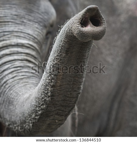
Hey skalman, looks great! I can't crit the lighting too much. If it looks good, you've done it the right way user added image. The thing that is jumping out at me unfortunately is the elephant trunk. Elephants have two adjacent nostrils like us. Also I would make the "finger" on the end of the trunk more pronounced, since they can actually pick up objects delicately with the end of their trunk (the morphology here depends on whether it is african or asian).

# 3 16-11-2014 , 10:10 PM
Skalman's Avatar
Registered User
Join Date: Apr 2012
Posts: 293
Thanks for the observation, stwert! it has two nostrils, allthough it may not be seen on the image, but I definetly get your point here, was watching through a few images and i clearly see wrong shapes in my trunk

user added image
user added image

thanks for noticing this man, i appreciate this user added image


20 year old guy from Sweden


Big Bob Marley fan
Love skateboarding
Maya, Mudbox and Photoshop user

Full name: Marcus Ralman


https://www.facebook.com/MarcusRalman3D

^ My facebook page ^

Last edited by Skalman; 16-11-2014 at 10:14 PM.
# 4 16-11-2014 , 11:53 PM
daverave's Avatar
The thin red line
Join Date: Aug 2009
Location: England
Posts: 4,472
If this is your first elephant very good, if I had to be picky I would say the same as Stwert and possibly add some more mesh detail to the trunk ridges and feet (in some thing like zbrush or mudbox).............dave


Avatar Challenge Winner 2010
# 5 17-11-2014 , 10:35 AM
honestdom's Avatar
The Nurb Herd
Join Date: Oct 2007
Location: London
Posts: 2,381
hey what you want to try and do is not have any of the creases or lighting baked into the texture. You have a detailed texture on a simple mesh here. I would work on
-some displacement maps (sculpt detail in zbrush)
-paint a purely diffuse texture for the colour.
-you will need a map for the glossiness
-paint a spec map.
-To see the shader better its a good idea to render with no colour map. This way you can judge the sss and spec easier. so give this a go.
-for more details I would add a fur groom.

# 6 12-12-2014 , 11:10 PM
elephantinc's Avatar
Level 32 pachyderm
Join Date: Dec 2007
Location: England
Posts: 1,859

# 7 13-12-2014 , 01:33 AM
Juanpax's Avatar
Having Fun!!!!
Join Date: May 2012
Location: Puerto Rico
Posts: 157
It looks pretty good. user added image

# 8 13-12-2014 , 06:26 PM
Dushyant's Avatar
Registered User
Join Date: Apr 2011
Location: On Earth
Posts: 168
hi
This is looking good so far. I like the topo user added image keeping creating user added image


-dushyant

Posting Rules Forum Rules
You may not post new threads | You may not post replies | You may not post attachments | You may not edit your posts | BB code is On | Smilies are On | [IMG] code is On | HTML code is Off

Similar Threads