Over the last couple of years UV layout in Maya has changed for the better. In this course we're going to be taking a look at some of those changes as we UV map an entire character
don't take this the wrong way but i think your model is a bit off in comparrison to your refference foto.
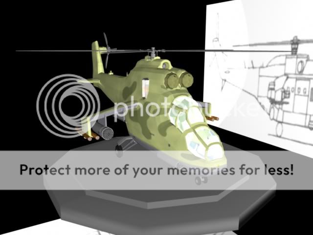
-the tail part should be a bit longer and scaled up a bit.
-the "wires"that go along the tail to control the rudder are missing .
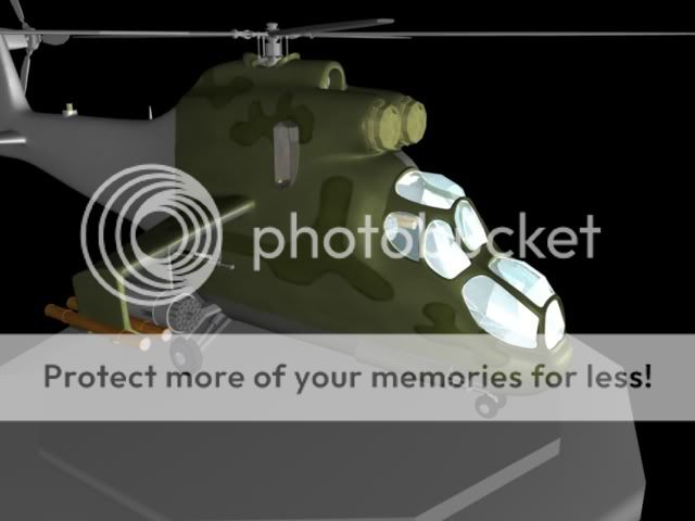
-on the side aswell as on the front there need to be more detailing .
- the rotor blade on the back is still missing
- the rotor on top off the helicopter needs to be a lot bigger
- the top of the helicopter is to round and should be longer
-the body stands under a slight angle on the landinggear
- the model isn't smooth enough delete half of your helicopter and replace this half with a smooth proxy.
i hope i didn't discourage you, but if you change these things your model will be that much better for it and so will your modeling skills.
Get as many sourceimages as you can get and preferably photos shot from different angles.
study them and if you work with 2 monitors put them in your secondary and look at them while you work on it in maya.
it is as petrol said ; do or do not..... there is no try
You can never be to harsh when commenting a work, critics only help me improve.
I will make some major changes on the overall "body" after the reference images(thanks for those by the way) I also noticed that I forgot the tail rotor.
But now I got some major school work to do so it will take a while before I can get to work again.
No problem on the reference pics. It's almost a shame though, I kinda like it's stubby look right now. It gives it a toon flavor. Really depends on whether you want realism or not.
Yeah I also kinda like that version but I do this to improve my skills so I dont mind doing different version to train modeling after reference(Kinda lazy when it comes to that)
After seeing the first few posts, this model wires look real good but the end result is a bit too cartoony at the moment. Which is sweet if thats what your after. Keep on looking at your refrence. Cheers
I remade some of the parts to fit the reference better. And now I want to focus on the texturing part, but sadly my texture looks to cartoonish(Yes I'm trying to make it realistic ) So any tips/tutorials would be awesome!
It is definetly a vast improvement comparing to the model you first made.
great job!!
About the texturing part ;
If i'm not mistaken you textured the color channel if you used the same texture on the specular color it would look more realistic, maybe even use the mental ray car paint shader(with clear coat).
other things that make something more realistic is the way you light your object(google it since there are much more people that know a lot more on the subject), and how much things get reflected in the scene ,use hdri and glob illum to fake this, in combination with maybe some 3d objects.
maybe depth of field ...
Good luck
I think I will start by totaly redoing the uv map then I will start tweaking with the lights and shader attributes and then I got to texture it again, so it will probably be a while before you hear from me again.
Dam its looking good!
I dont know if its much help but these tutorials helped me a bit with adding weathered looks and rivits to your textures. https://www.simmerspaintshop.com/foru...m37-photoshop/
Keep posting your progress :p
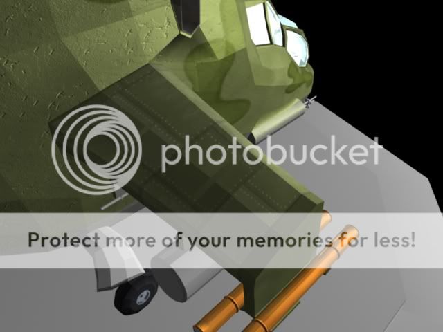
Sadly I havent had that much time to work on this project lately mostly becouse of school. But I've managed to do the basic painting on the whole helicopter and start painting details on the wing.
Critics on modeling/texturing issues I got now would be great .
You may not post new threads |
You may not post replies |
You may not post attachments |
You may not edit your posts |
BB code is On |
Smilies are On |
[IMG] code is On |
HTML code is Off