Complex UV Layout in Maya
Over the last couple of years UV layout in Maya has changed for the better. In this course we're going to be taking a look at some of those changes as we UV map an entire character
#
31
06-10-2007
, 09:14 PM
Yeah will have a few more days on Talos before paid work kicks in again, but after that back to Talos and building first female character.
I still haven't seen any of your tutes, be kinda weird for me lol.
Gio
#
32
06-10-2007
, 09:47 PM
To be fair I had most of this body ready from a previous character, but just made a few adjustments.
Need to give him a new 'old man' texture for his hands as they will appear in a few tight shots, typing It will make sense when you see the shots and it will be more interesting that it sounds.

Shot at 2007-10-09
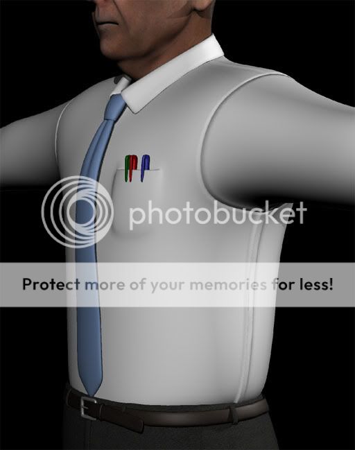
Needs a pocket on the shirt with a few pens in it of course.
Will send him to ZB to reshape him a bit
Gio
#
33
07-10-2007
, 07:04 AM
Character looks good, be careful on that armpit, reduce it in size a bit more, I know thats how shirts hang in that area, but Im thinking of your rig. Add some detail to the strides too, they look a tad starchy! LOL
overall nice proportions....
Jay
#
34
07-10-2007
, 01:43 PM
I have a blend for the pits to pull them in as you say for rigging.
As for shape, haven't reshaped him yet, it's just a default bod at the mo. Will hunch him over slightly and so on. Just got to add a few more bit to the default body and then I'll start giving him a bit more character in the body shape.
Gio
#
35
09-10-2007
, 12:27 PM

Shot at 2007-10-12
will move on to rigging and hair for this dudes some time next week as I will be getting Maya 2008 and there are new rigging feature and I will update my Shave and a Haircut, so
I gonna move on to another character now and will post a thread for him shortly.
Gio
#
36
09-10-2007
, 12:32 PM
_J
#
37
09-10-2007
, 12:52 PM
Once I put his hair on I'll see if he needs a touch up on the maps on his patch.

Shot at 2007-10-12
Gio
#
38
09-10-2007
, 12:56 PM
Its okay, it was a query is all, just the Open GL shot wasnt doing it any favours in your last post.
_J
#
39
09-10-2007
, 03:34 PM
#
40
10-10-2007
, 07:55 AM
arran: Thanks. There was a bump which can be seen on the image at the top of the page which I smoothed out for the following picture. Will double check though to see if it needs a bit more work.
He's not done with yet. Will create some bump/normal maps for seams and stitching.
Gio
#
41
10-10-2007
, 10:19 AM
This guy looks like a teacher in highschool that I didn't like and that didn't like me.
Good work Gio, looking forward to seeing the other guy you started.
#
42
10-10-2007
, 10:53 AM
Zbrush does make organic modeling a lot easier, and more enjoyable. Although it still requires exactly the same patience and attention to the basic principles as any other software method. However making changes to form are far more intuitive and speedy, and it will allow you to take you work further. Until the next version of maya when perhaps it will get the mudbox intergration which would be interesting.
I'll be flitting between this and the soldier character at the mo as I needed a break from creating old men in suits, as this one is the third 'suit' I needed for the opening pages, but then things get more interesting.
Gio
#
43
07-12-2007
, 07:55 PM
back to this guy now. just started adding a bit more detail to the shirt. The pocket is now part of the shirt mesh but needs some stitching and detail still.


Gio
#
44
08-12-2007
, 02:59 AM
#
45
08-12-2007
, 08:25 AM
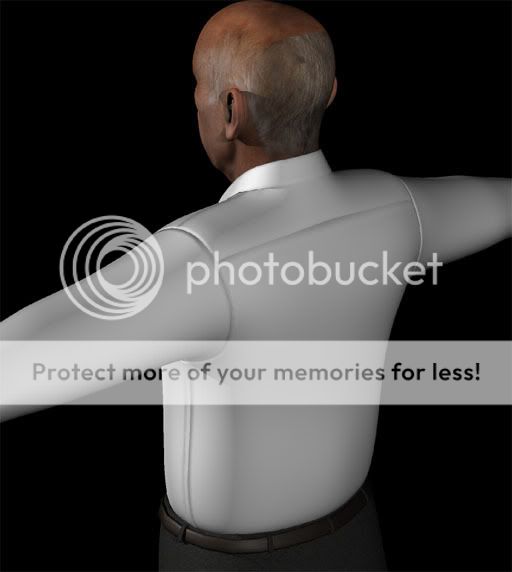
 one thing that stands out is the texture of his hair where it starts at the back - it's just looking a bit straight at the moment.
Posting Rules Forum Rules
Similar Threads
Setting Up a Project?
by Ethan Dale in forum Maya Basics & Newbie Lounge replies 3 on 28-04-2017
The Talos Project - WIP
by GioChrono in forum Work In Progress replies 237 on 08-05-2016
Professor Cain - The Talos Project
by GioChrono in forum Finished Work replies 18 on 08-06-2008
Security Guard/Soldier - The Talos Project
by GioChrono in forum Work In Progress replies 76 on 02-12-2007
Project number 2: maya human head model
by ctbram in forum Work In Progress replies 32 on 02-04-2004
Topics
New tutorial - Create tileable textures from photos. Photoshop to Alchemist to Maya 2
By David
Site News & Announcements
3
Free Courses
Full Courses
VFX News
How computer animation was used 30 years ago to make a Roger Rabbit short
On 2022-07-18 14:30:13
Sneak peek at Houdini 19.5
On 2022-07-18 14:17:59
VFX Breakdown The Man Who Fell To Earth
On 2022-07-15 13:14:36
Resident Evil - Teaser Trailer
On 2022-05-13 13:52:25
New cloud modeling nodes for Bifrost
On 2022-05-02 20:24:13
MPC Showreel 2022
On 2022-04-13 16:02:13


