Complex UV Layout in Maya
Over the last couple of years UV layout in Maya has changed for the better. In this course we're going to be taking a look at some of those changes as we UV map an entire character
# 1 16-11-2007 , 04:04 AM
aleg8r's Avatar
Registered User
Join Date: Jun 2005
Location: ireland
Posts: 158

Jaguar E type Concept

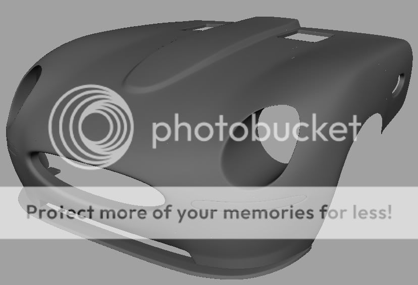
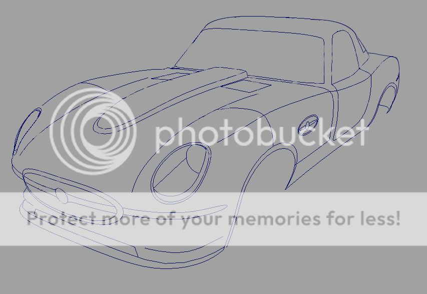
I have been looking at the ford concepts of classics like the GT, Cobra, and Mustang. I then looked for an iconic classic that does not have a modern concept yet, and the first thing that popped to mind was the E Type.

so here is my cage:

user added image

and the start:

user added image

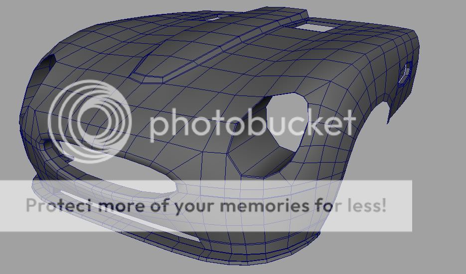
Wire 1:

user added image

Wire 2:

user added image

C&C Please


My Website
PROUDLY SOUTH AFRICAN
# 2 16-11-2007 , 04:19 AM
Acid44
Guest
Posts: n/a
nice concept man makes me want to fix my comp even more...

:bow: user added image


user added image

# 3 16-11-2007 , 04:27 AM
# 4 16-11-2007 , 12:38 PM
aleg8r's Avatar
Registered User
Join Date: Jun 2005
Location: ireland
Posts: 158
thanks guys user added image

some more work

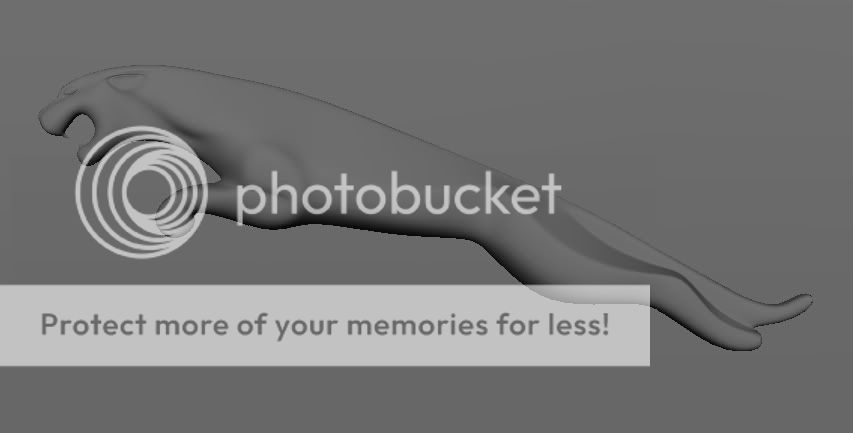
i changed the hole on the side of the car to a jaguar emblem.

user added image

the lights first draft.

user added image

the jaguar on the side of the car.

user added image

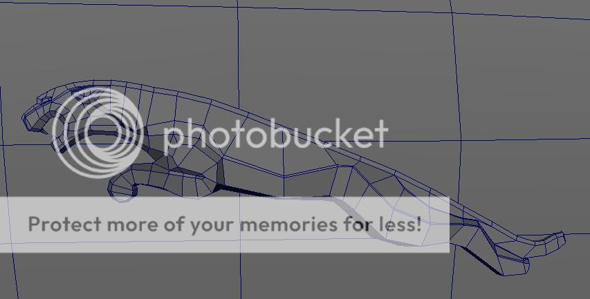
the wire.

user added image

C&C Please


My Website
PROUDLY SOUTH AFRICAN

Last edited by aleg8r; 16-11-2007 at 12:43 PM.
# 5 16-11-2007 , 02:16 PM
gster123's Avatar
Moderator
Join Date: May 2005
Location: Manchester Uk
Posts: 6,300
Liking the concept man, looks great, to me its got a bit of the dodge viper in there, might just be the angle of the pic but I would probaly have made the front a bit longer/back shorter, but then agin its a concept so its personal pref!

The wires look nice and clean, I really need to do a car model, not done one for ages!

The Jag emblem looks good, not too sure about its positioning though, kinda breaks up the flow of the body so to speak, maybe give it one of the standard round ones and leave that to the boot area??

As I say its looking real good, looking forward to seeing how you develop it!


"No pressure, no diamonds" Thomas Carlyle
# 6 16-11-2007 , 07:10 PM
louis56's Avatar
Registered User
Join Date: Jul 2007
Location: Australia
Posts: 344
Wow. just wow. Thats one sexy model.

@acid: I thought your computer was fixed already user added image


Visit www.Notice-Board.co.nz for FREE online classifieds, notices and ads in your area!!
# 7 17-11-2007 , 01:23 AM
aleg8r's Avatar
Registered User
Join Date: Jun 2005
Location: ireland
Posts: 158

Originally posted by gster123
Liking the concept man, looks great, to me its got a bit of the dodge viper in there, might just be the angle of the pic but I would probaly have made the front a bit longer/back shorter, but then agin its a concept so its personal pref!

The wires look nice and clean, I really need to do a car model, not done one for ages!

The Jag emblem looks good, not too sure about its positioning though, kinda breaks up the flow of the body so to speak, maybe give it one of the standard round ones and leave that to the boot area??

As I say its looking real good, looking forward to seeing how you develop it!

thanks , well the original has a viper style front end, or should i say the viper has a E Type front end user added image, long hood user added image

i have made the back end shorter then the original and made the cockpit larger to fit todays larger persons (*hides*)

the emblem on the sides are there to brake the large amount of metal on the side of the car and i didnt like the hole to much

so for todays update.

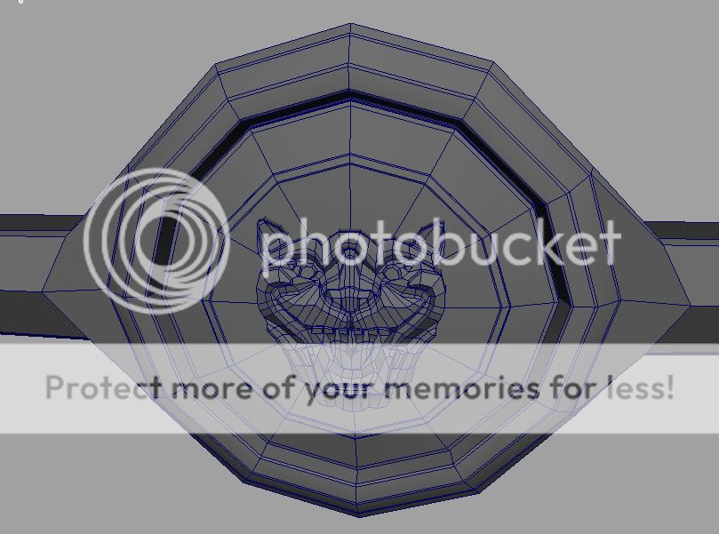
more work on the emblems made the face for the front, it took 2 hours and its not perfect, but its small.

user added image

the wire.

user added image

C&C Please


My Website
PROUDLY SOUTH AFRICAN
# 8 17-11-2007 , 02:49 AM
Acid44
Guest
Posts: n/a
sweet work on the deatails man keeep it up. are you gonna be doing the interior aswell?

@louis- no im using my brother-in-law's comp causee mines still screwed otherwise id be workin on my clio

user added image

# 9 17-11-2007 , 10:47 AM
aleg8r's Avatar
Registered User
Join Date: Jun 2005
Location: ireland
Posts: 158

Originally posted by acid44
sweet work on the deatails man keeep it up. are you gonna be doing the interior aswell?

@louis- no im using my brother-in-law's comp causee mines still screwed otherwise id be workin on my clio

user added image

i donno if i keep interest in this model them maybe user added image thats the main reason why i dont really finish most models user added image

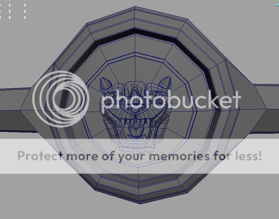
Update:

rework of the head emblem, made it more aggressive.

user added image

user added image


My Website
PROUDLY SOUTH AFRICAN
# 10 17-11-2007 , 04:37 PM
Minstrel's Avatar
Subscriber
Join Date: Nov 2002
Location: Made in Spain
Posts: 422
Wow, thats fantastic work on the emblems. Wouldn't it be easier to do a displacement map?

# 11 17-11-2007 , 05:02 PM
starjsjswars's Avatar
Subscriber
Join Date: Jan 2006
Location: IL
Posts: 1,052
nice work... i really like the dog.


A great mod for Jedi academy www.moviebattles.com

Computer Rig-

64-bit vista
23.5 inch LCD + a 19 inch
Q6600 intell qaud
4 gigs of ddr2 ram
8800GTS 512 video card @700mhz
# 12 17-11-2007 , 05:58 PM
louis56's Avatar
Registered User
Join Date: Jul 2007
Location: Australia
Posts: 344
Its a tiger jeeeez lol


Visit www.Notice-Board.co.nz for FREE online classifieds, notices and ads in your area!!
# 13 17-11-2007 , 08:09 PM
aleg8r's Avatar
Registered User
Join Date: Jun 2005
Location: ireland
Posts: 158

Originally posted by Minstrel
Wow, thats fantastic work on the emblems. Wouldn't it be easier to do a displacement map?

i donno how to draw them in photoshop plus why user added image i am not ganna animate the car so why no model the detail for a better image.

@starjsjswars : its a jaguar not a dog. user added image

(nor a tiger) user added image

:attn: :attn: :attn: :attn: :attn: :attn:

thanks guys user added image


My Website
PROUDLY SOUTH AFRICAN
# 14 18-11-2007 , 05:16 AM
DJbLAZER's Avatar
Registered User
Join Date: Jun 2004
Location: Gothenburg, Sweden
Posts: 1,318
Displacement maps as nothing to do with animating. It's the same thing as bump mapping except that the geometry is changed for real at render time.

So a displacement map for that emblem would probably have taken about 5 minutes to create in photoshop (with better quality). It increases render times though.

# 15 18-11-2007 , 06:45 AM
99GsTurbo's Avatar
Subscriber
Join Date: Oct 2006
Location: Boston
Posts: 566
nice modeling...displacement maps are nice but the effect of a real modeled thing is better...like with tire sidewalls and tread etc... looks way better modeled imo

anywho...good job


Toyota Supra WIP


I create feeling in others that they themseleves don’t understand.
Posting Rules Forum Rules
You may not post new threads | You may not post replies | You may not post attachments | You may not edit your posts | BB code is On | Smilies are On | [IMG] code is On | HTML code is Off

Similar Threads