Digital humans the art of the digital double
Ever wanted to know how digital doubles are created in the movie industry? This course will give you an insight into how it's done.
# 1 19-06-2008 , 02:31 AM
99GsTurbo's Avatar
Subscriber
Join Date: Oct 2006
Location: Boston
Posts: 566

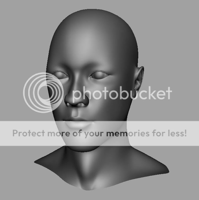
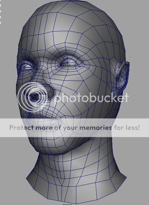
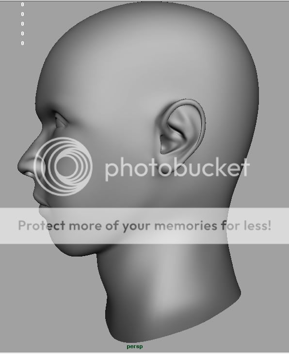
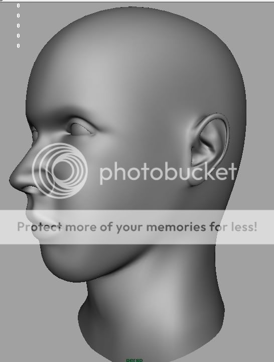
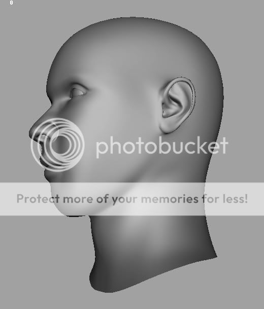
Ok, another attempt at a human

I know I know...lol I have thousands of unfinished projects but I want to switch to organics so until i get the hang of it...you might be seeing tons of head until it comes natural to me lol...

user added image
user added image
user added image
user added image


Toyota Supra WIP


I create feeling in others that they themseleves don’t understand.

Last edited by 99GsTurbo; 19-06-2008 at 02:53 AM.
# 2 19-06-2008 , 02:33 AM
99GsTurbo's Avatar
Subscriber
Join Date: Oct 2006
Location: Boston
Posts: 566
The eyes need a bit or work...still trying to fix things up...also the forehead looks a bit funny now that im looking at the images....more work later..C&C always welcomed


Toyota Supra WIP


I create feeling in others that they themseleves don’t understand.
# 3 19-06-2008 , 02:52 AM
lealar's Avatar
Registered User
Join Date: Mar 2006
Posts: 296
That's ok now than before one, very clean lines. Good work, waiting for more.

user added image

# 4 19-06-2008 , 02:55 AM
99GsTurbo's Avatar
Subscriber
Join Date: Oct 2006
Location: Boston
Posts: 566

Originally posted by lealar
That's ok now than before one, very clean lines. Good work, waiting for more.

user added image

Thanks bro....cheers user added image


Toyota Supra WIP


I create feeling in others that they themseleves don’t understand.
# 5 19-06-2008 , 06:00 AM
arran's Avatar
Registered User
Join Date: Dec 2005
Location: Brooklyn, NY
Posts: 3,708
yeah - nice job mate - every model is getting better and better.user added image

the eyes are maybe a little high and it looks like you need to better define the back of the head - it (usually) really bulges out at the back. also, the lips are looking a little pinched at the corners. the bottom lip really tucks under the top one - if you get that right, it will really help make his mouth convincing.

# 6 19-06-2008 , 06:35 AM
99GsTurbo's Avatar
Subscriber
Join Date: Oct 2006
Location: Boston
Posts: 566

Originally posted by arran
yeah - nice job mate - every model is getting better and better.user added image

the eyes are maybe a little high and it looks like you need to better define the back of the head - it (usually) really bulges out at the back. also, the lips are looking a little pinched at the corners. the bottom lip really tucks under the top one - if you get that right, it will really help make his mouth convincing.

cheers arran...thanks for the comments.......

what's funny is I've been working on the head shape all day...either he looks like an alien...or a pear head...lol...thats one of the things ill deffinately continue working on until I get it fixed... you read my mind... it seems this is the hardest part for me..this and the back of the neck.

well, as far as the lips are concerned....its not really a pinch, I know the bottom tucks under the top .... so i think the problem is I have it tucked too far under the top...been tryin to get the overlaping feeling but when I tuck it a little...it wasn't looking right and I guess this is tucked too far under.....will continue working on it

haha and the eyes..whats funny is because the guy I'm using for ref images...i thought his eyes looked funny because they "arent the ideal" look...his eyes are high so I lowered them to do my model some justice lol...ill post more angles up later but I have to better define them as well as get the sitting around the eyeball correctly...right now the eyes is comming out a little further then the socket on the bottom lid and too far in on the top lid....well hopefully more updates when I get out of work and thanks for the observations.....


Toyota Supra WIP


I create feeling in others that they themseleves don’t understand.

Last edited by 99GsTurbo; 19-06-2008 at 07:45 AM.
# 7 19-06-2008 , 07:08 AM
arran's Avatar
Registered User
Join Date: Dec 2005
Location: Brooklyn, NY
Posts: 3,708
ha - he doesn't look like a pear head or an alien mate! user added image he's actualy looking really cool. tho if you're having problems 'seeing' him, take a break and do something else for a bit. when you come back to him, you definitely won't think he looks like a pear head! or if you have to keep working on him, try using a mirror to get a fresh look .

yeah, every head is definitely different. i'm doing a model based on vincent schiavelli at the moment and trust me, he had one funny looking head, so nothing is set in stone. at the end of the day, you're the best judge, so sometimes you just have to ignore certain crits.

if you get a chance, see if you can take a look at jason osipa's book, stop staring. he does a really good job of descibing how to model the lips and other parts of the head.

keep at it turbo! user added image

# 8 19-06-2008 , 07:15 AM
younglion's Avatar
Registered User
Join Date: Jun 2005
Location: t-dot
Posts: 646
very clean work dont have any crits i like the fact that its not the "ideal head model". keep it up

# 9 24-06-2008 , 09:33 PM
99GsTurbo's Avatar
Subscriber
Join Date: Oct 2006
Location: Boston
Posts: 566
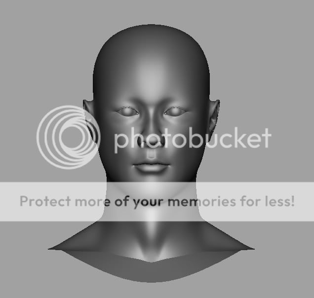
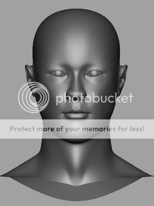
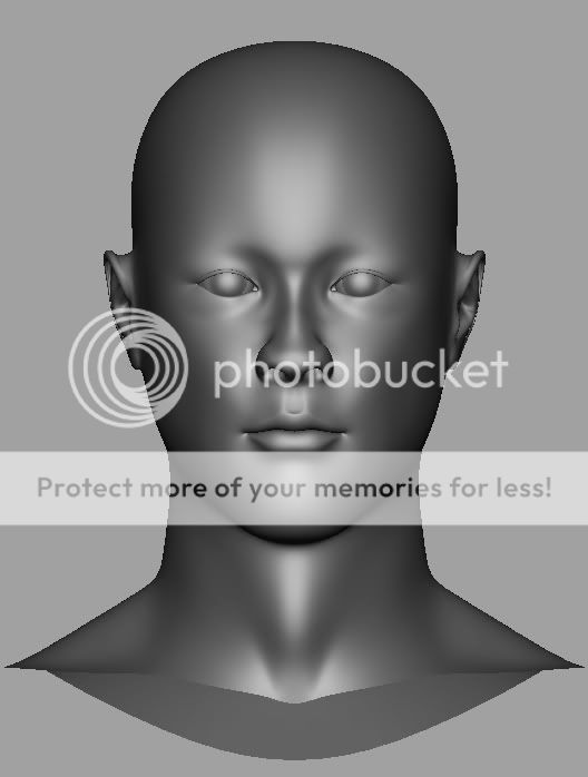
Thanks arran and young....arran, i fixed the lips...i think im done for now..time to move onto the next part lmao....here an update..fixed the eyes..the nose...the lips..and the head shape

user added image
user added image
user added image
user added image


Toyota Supra WIP


I create feeling in others that they themseleves don’t understand.
# 10 24-06-2008 , 10:28 PM
arran's Avatar
Registered User
Join Date: Dec 2005
Location: Brooklyn, NY
Posts: 3,708
yeah - the lips are looking a lot better user added image - watch the outer corner of the eyes tho - they look a little high.

# 11 24-06-2008 , 11:09 PM
99GsTurbo's Avatar
Subscriber
Join Date: Oct 2006
Location: Boston
Posts: 566

Originally posted by arran
yeah - the lips are looking a lot better user added image - watch the outer corner of the eyes tho - they look a little high.

that's good that you noticed that...the eyes I'm using as reference slanted upwards....i didn't think it had the upwards feeling but I guess it does which is good since that's what I was going for......thanks for the comments arran


Toyota Supra WIP


I create feeling in others that they themseleves don’t understand.
# 12 25-06-2008 , 12:44 AM
vladimirjp's Avatar
Subscriber
Join Date: Jun 2003
Location: stuck in the 90's boston, USA
Posts: 1,871
his eyes look so chinggy? was he smoking some herbals by any chance. heheheheuser added image

# 13 25-06-2008 , 12:50 AM
99GsTurbo's Avatar
Subscriber
Join Date: Oct 2006
Location: Boston
Posts: 566

Originally posted by vladimirjp
his eyes look so chinggy? was he smoking some herbals by any chance. heheheheuser added image

yea..he was smoking a blunt before hoping in my skyline...him and his chicana....


Toyota Supra WIP


I create feeling in others that they themseleves don’t understand.
# 14 25-06-2008 , 08:50 AM
gster123's Avatar
Moderator
Join Date: May 2005
Location: Manchester Uk
Posts: 6,300
Looking pretty good.

The ears look like they need a bit of work, not the shape but how they joint to the head.


"No pressure, no diamonds" Thomas Carlyle
# 15 25-06-2008 , 07:51 PM
99GsTurbo's Avatar
Subscriber
Join Date: Oct 2006
Location: Boston
Posts: 566
ok thanks gster....will work on the ears....also...here are the 2 eyes i did...which one do you guys like best....slight difference...really more on the corner...cheers..cant wait to hear feedback...


user added image
user added image


Toyota Supra WIP


I create feeling in others that they themseleves don’t understand.
Posting Rules Forum Rules
You may not post new threads | You may not post replies | You may not post attachments | You may not edit your posts | BB code is On | Smilies are On | [IMG] code is On | HTML code is Off

Similar Threads