Beer glass scene creation
This course contains a little bit of everything with modeling, UVing, texturing and dynamics in Maya, as well as compositing multilayered EXR's in Photoshop.
# 1 23-05-2006 , 03:23 PM
Eldwick's Avatar
Subscriber
Join Date: Mar 2006
Location: Washington, DC
Posts: 195

Cartoon Ani

This might be a bit of a leap but I really want to get into animation. So I am trying to make a neighborhoodesque type chartoon with the character I made a while back (https://forum.simplymaya.com/showthre...threadid=20902). This scene I'm making now is a little intro for the chartoon, he'll make/eat breakfast and then he will hear his window break and look up and see a ball on the kitchen counter and two boys peering through, with a baseballl bat smiling nervously.

I made this quick playblast just to see how my rigging went and to see how he looked in the scene: Playblast

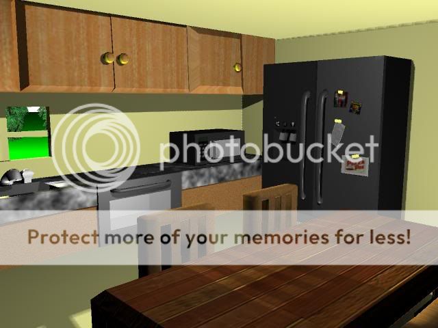
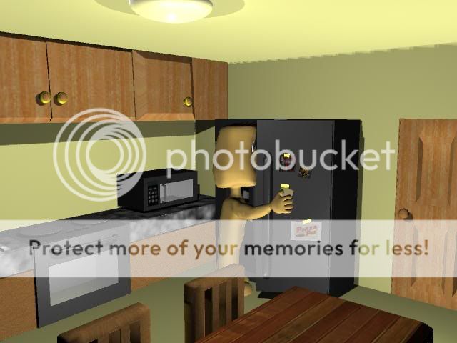
Some quick renders of the scene still a wip

user added image
user added image


Last edited by Eldwick; 23-05-2006 at 03:52 PM.
# 2 23-05-2006 , 07:56 PM
Registered User
Join Date: Jan 2006
Posts: 9
possible suggestions right now, see what the doorand window would look like with a frame on it, something to make it seem like a door and a window instead of just a hole cut into the walls.

other then that, the only other thing is that it all looks offscale, somethings are huge (table, chairs, fridge) while the counter is really low and the cupboards seem to be up really high.

what does it look like with the character in the scene? might make the scaling seem better if it's compared to the character.

# 3 23-05-2006 , 10:09 PM
Eldwick's Avatar
Subscriber
Join Date: Mar 2006
Location: Washington, DC
Posts: 195
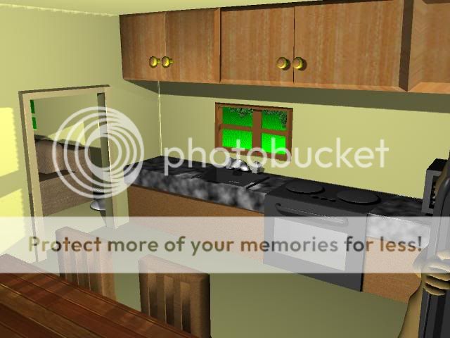
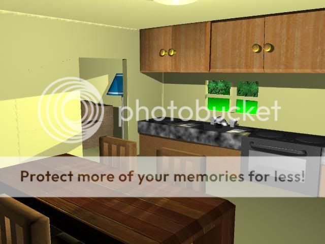
Thanks for the advise here is a revised kitchen:
user added image
user added image

# 4 23-05-2006 , 11:52 PM
twisteddragon33's Avatar
Registered User
Join Date: Apr 2003
Location: New York, USA
Posts: 1,945
i agree about the scaling. The cupboards are way too high .counters too low. fridge looks a little small to me aswell...


________________________
AIM: SublimeDragon33
Catch me if i'm on. Always up for a chat.
e-mail: sublimedragon33@gmail.com
# 5 25-05-2006 , 01:11 AM
Lt Jim's Avatar
Subscriber
Join Date: Sep 2004
Location: Queens, New York City
Posts: 367
I was wondering how you've been doing with that character of yours! Your background is coming along nicely! My only suggestion is to try a different texture for the sink area. It looks a bit "outsized" for marble (or faux marble). I really like the wood finish on your table, however!

My comments are mainly aimed at your playblast. Even if the character has that "zombie" stare (as many of us do in the morning), you should have his head move up and down a bit as he walks. Never settle for the "default" curves! WAY too mechanical! Play around with the curves in the Graph Editor. It WILL become your best friend if you take the time to learn how to use it now! Otherwise, I like the way the character came out in the end!

Keep at it and keep us all posted! :-)


"Ad astra per aspera..."
# 6 25-05-2006 , 02:21 PM
Eldwick's Avatar
Subscriber
Join Date: Mar 2006
Location: Washington, DC
Posts: 195
Okay I havn't worked on this yet, have been modeling some other characters, but here is my first attempt at a walk cycle I used in the previous playblast. Walk Cycle

I have no idea how to use the graph editor well, I normaly just turn off all the easing that it does. But I also want to learn how to use the Trax editor, does anyone suggest the one digital tutors just released?


Last edited by Eldwick; 25-05-2006 at 08:14 PM.
# 7 26-05-2006 , 07:21 AM
NeoStrider's Avatar
Registered User
Join Date: Jun 2004
Location: Cleveland, Ohio (USA)
Posts: 1,541
from my experience, the trax editor is better for moving keyframes around in order to get timing right with different objects... at the same time, the graph editor can do the same, but instead of moving keyframes (although you can do that too) it helps alter the ease-in and ease-out of each motion. if you think a motion is going too fast or too slow you can alter the actual rate of movement in the same amount of time instead of moving the keyframes and making said action take less time or more time. originally when i would edit in the graph editor i would turn off all tangent weights and watch the animation, then turn them back on per keyframe to adjust the build-up or slow-down of a motion. it's like imagining a pitcher on the mound or a car at a starting line in the fast and the furious... they each start up with a slow motion and then as they reach the end of their movement they get faster and faster... that would be something to use the graph editor for. the trax editor would be best used for moving keyframes of one (or several) objects because they don't take enough time or take too long to complete their motion. although this is just how i used the different editors, i'm sure others in the forums would be able to give you greater insight to the positives and negatives for both the graph and trax editor.

anyone care to add to or correct my statement?


Accept no substitutions.
# 8 30-08-2006 , 02:41 PM
Subscriber
Join Date: Feb 2006
Posts: 1,937
haha love it all espiecally the wood texture on the table =] 10/10

Posting Rules Forum Rules
You may not post new threads | You may not post replies | You may not post attachments | You may not edit your posts | BB code is On | Smilies are On | [IMG] code is On | HTML code is Off

Similar Threads