Integrating 3D models with photography
Interested in integrating your 3D work with the real world? This might help
# 1 15-12-2009 , 11:14 PM
ctbram's Avatar
Moderator
Join Date: Jan 2004
Location: Michigan, USA
Posts: 2,998

humble bottle cap...

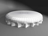
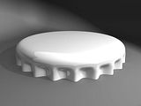
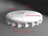
Someone asked how to model a bottle cap over at the luxology website and one of the users there actually works in the art department at Coca-Cola and he offered this topology.

I thought it was interesting and demonstrates that n-gons are not always bad. The 22 flutes of the bottle cap have an n-gon at the top of each one but results in a very pleasing and natural looking cap.

There are 132 faces around the bottom (fluted) area that transition into 66 faces around the middle sections, and finally reduce to 33 4-sided faces at the cap. There is another n-gon on the interior face of the cap section but that will never really be seen.

This tutorial also demonstrates where pattern selection would be a useful feature to see added to Maya.

Here is what we make...
user added image user added image user added image

Here is a link to the short tutorial at screencast.com

https://www.screencast.com/t/NjdjZjZiYW

If I have run out of bandwidth goto youtube.com

https://www.youtube.com/watch?v=82qFrj_0jEE&fmt=22


"If I have seen further it is by standing on the shoulders of giants." Sir Isaac Newton, 1675

Last edited by ctbram; 16-12-2009 at 06:28 AM.
# 2 16-12-2009 , 02:47 AM
Joopson's Avatar
Registered User
Join Date: Jul 2005
Location: Boston, MA
Posts: 2,314
Wait, where are the n-gons?


EDIT: Oh wait, do you mean the 5-sideds? those aren't that bad. The reason why N-gons are usually considered bad is because of animation (they deform strangely), but for something like this, there is absolutely no reason not to N-gon until the cows come home.


EDIT #2: Unless it screws up the smoothing, haha.


Environment Artist @ Plastic Piranha
www.joopson.com

Last edited by Joopson; 16-12-2009 at 02:50 AM.
# 3 16-12-2009 , 04:26 AM
ctbram's Avatar
Moderator
Join Date: Jan 2004
Location: Michigan, USA
Posts: 2,998
Yes, I am fully aware of when n-gons cause problems.

I found this was just a good example of when they can actually be useful as many just learning modeling get it in their heads that "an occasional tri is okay but n-gons are NEVER allowable" which is just not true. You certainly do not want to go crazy with them but they can in the right circumstances add useful surface details and help to reduce poly count.

The two primary problems with n-gons are - as you point out - they can cause problems when used in areas of deformation and they can cause smoothing and texturing anomalies.

I had mentioned this in my initial post but then removed it during an edit and forgot to put it back in. Thank you for bringing it to my attention.


"If I have seen further it is by standing on the shoulders of giants." Sir Isaac Newton, 1675

Last edited by ctbram; 16-12-2009 at 06:37 AM.
# 4 16-12-2009 , 07:28 AM
daverave's Avatar
The thin red line
Join Date: Aug 2009
Location: England
Posts: 4,472
Another nice little tutorial ctbram ............dave

PS. where are you with that hi rez mesh you were doing any updates

# 5 16-12-2009 , 05:30 PM
ctbram's Avatar
Moderator
Join Date: Jan 2004
Location: Michigan, USA
Posts: 2,998
Thanks Dave,

I am back trying to figure out how to texture my sand speeder. Texturing really has me befuddled. My model is more complex then the one in Jay's tutorial and I really want to add panel line and rivet details using bump, color, and spec maps but I am having a terrible time trying to figure out how to do it.

It's really a problem with both the actual texturing and UV Layout. In the WIP posts I have screen shots of my UV layouts and you can see from the UV test maps the UV's a clean and even. But the maps are not layed out nice and square like I see a lot of other peoples UV maps. Which makes texture painting easier. When I try to scoot UV's around to lay them out in nice horizontal and vertical rows and columns (which is an incredible pain in the ass btw) the map goes all wonky and quite frankly I cannot see how it would be possible prevent this based on the shape of the objects. So there has to be something I am missing. I could break the parts into tons of smaller sections that would lay out in nice square patches of UV's but then I have a bazillion seams.

There are seriously no good tutorials on the way to layout and texture a highly detailed model anywhere. I see tons of finished works that do exactly what I want to do but not one person really seems to want to reveal the secrets of how to do it.

Everything I have found on texturing is for zbrushing organic models. There are tons of these tuts in nauseating detail. But everything I can find on hard surface detailing is so remedial as to be completely useless!

It's very frustrating seeing finished stuff with with the kind of detail I want, all done with color and bump and spec maps but nothing describing how to do it!!!


"If I have seen further it is by standing on the shoulders of giants." Sir Isaac Newton, 1675

Last edited by ctbram; 19-12-2009 at 11:32 AM.
# 6 16-12-2009 , 06:29 PM
G-Man's Avatar
Subscriber
Join Date: May 2004
Location: Bowling Green. Kentucky U.S.A.
Posts: 810
ctbram
check you're P.M. and add me to messenger (s)
When i get off work at night i'm usually on all night, I Can help you with these texturing issues.

G-man


Follow My Business
On The Web!
Or
On Facebook!
# 7 16-12-2009 , 06:41 PM
gster123's Avatar
Moderator
Join Date: May 2005
Location: Manchester Uk
Posts: 6,300
Check out Steven Stahlbergs work for where and when to use tri's and ngons.

You just need to know when and where to use them as well as what the smoothing algorithm, does or attempts to do, to get the best from them, similar to using boolians.


"No pressure, no diamonds" Thomas Carlyle
# 8 16-12-2009 , 08:08 PM
honestdom's Avatar
The Nurb Herd
Join Date: Oct 2007
Location: London
Posts: 2,381
yeah Steven Stahlberg's work is great. Some of the guys at work have been showing me the best situations to use 5 sided polys on head models.

ctbram - i like the material you are using to show your renders now. its more interesting than the ambient occlusion you used to use.

# 9 16-12-2009 , 10:11 PM
ctbram's Avatar
Moderator
Join Date: Jan 2004
Location: Michigan, USA
Posts: 2,998
thanks h.h. I have been liking the phong material lately (smile).

legend thanks. I will set up my messenger account asap.

gster - yes, I agree steven's stahlberg's work is exceptionally good and I was thinking of his stuff when I saw this models topology. More importantly I wanted to do the video to show all the parts of the process where pattern selection would be nice to have in maya.

Although the bottle cap is a very simple object I found it challenging when I tried to model it just using the image of the topology that was posted on the luxology tips and tricks section. I originally started with a 132 sided cylinder and worked down to 33 and it was very inefficient in maya. The final method was based on something I saw over at luxologies page that I modified a bit for maya vs. modo.

So I thought it might be something worthy of posting. I hope it will be something helpful.

I have had an interest in Modo lately but to be honest I am too comfortable with Maya's workflow to want to switch. I would rather see some of Modo's powerful selection abilities and other features added into Maya's tool set, so I am taking any opportunity to make a shameless plee. Maybe it might catch someone at Autodesk's attention.


"If I have seen further it is by standing on the shoulders of giants." Sir Isaac Newton, 1675

Last edited by ctbram; 26-12-2009 at 05:15 PM.
Posting Rules Forum Rules
You may not post new threads | You may not post replies | You may not post attachments | You may not edit your posts | BB code is On | Smilies are On | [IMG] code is On | HTML code is Off

Similar Threads